Preview image. Unlock full-res
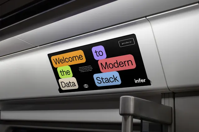
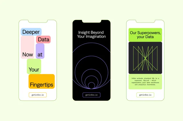
A transit card ad on a black ground where each word of the headline sits in its own coloured rounded block, tiled into an offset grid.
More like this
See all
Summary
An overhead subway advertising card that breaks a six-word headline into six coloured tiles, staggered into two offset columns on black.
Visual description
The card is mounted in the curved panel above a train window, photographed at a sharp angle so the black panel skews across the frame against brushed grey interior surfaces. On the black field, six rounded-rectangle blocks each hold one word in heavy black grotesque: an amber block reading "Welcome", a lime block reading "the", and a cream block reading "Data" run down the left; a lavender block reading "to", a coral block reading "Modern" and a pale blue block reading "Stack" run down the right, each sitting half a step lower than its neighbour so the two columns interlock. Block widths follow word length, so the grid is deliberately ragged. Three lines of small white body copy sit in the gap at the centre left, a small white eye mark sits low centre, the lowercase "infer" wordmark sits bottom right in white, and a thin outlined pill holding the url in monospace sits top right.
Key takeaway
Setting one word per coloured block lets the palette be the layout: colour count and word count are the same number, and the offset columns create reading order without any rules or arrows. The dark ground makes six unrelated pastels behave as a single system.
Reuse notes
Good for transit, digital display and social formats where the format is wide, the message is short and the brand needs to look approachable rather than corporate. It needs a headline of five to seven short words; longer copy makes the blocks too small to keep their radius. Watch black type on the darker pastels, and note that the same tiles reflow badly to a portrait crop.