Preview image. Unlock full-res
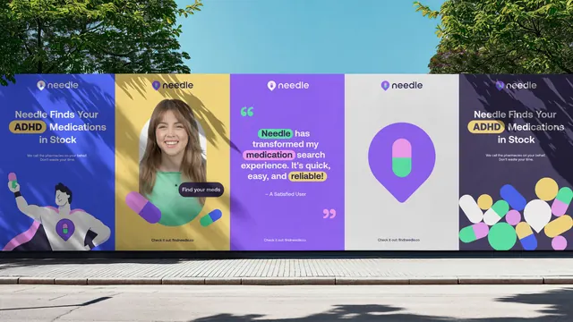
Five vertical Needle posters mounted side by side on a street hoarding, each a different colourway of the same pin and capsule identity.
More like this
See all

Summary
An outdoor mockup running five poster variants in a row, showing how one healthcare identity flexes across message types by swapping background colour rather than layout.
Visual description
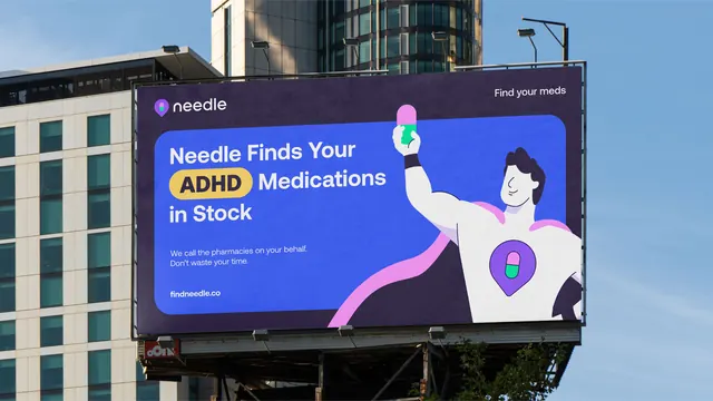
A street-level hoarding sits below a blue sky with tree canopy at both edges and a tiled pavement in front; leaf shadows fall diagonally across the poster faces. Each of the five portrait panels carries the Needle lockup at the top, a map pin whose interior is a two-tone capsule next to a lowercase rounded wordmark. Panel one, royal blue, sets the headline "Needle Finds Your ADHD Medications in Stock" with "ADHD" highlighted in a yellow pill, two lines of small support copy, and a flat-illustrated superhero character in a white cape with a pin badge on his chest holding a capsule. Panel two, mustard yellow, is a cut-out portrait of a smiling woman in a mint top with a dark "Find your meds" tooltip pill and loose capsules around her. Panel three, violet, is a testimonial in large white type with three words highlighted in mint, pink and yellow pills, oversized quote marks top left and bottom right, and the attribution "A Satisfied User". Panel four, light grey, is the pin mark alone at poster scale. Panel five, dark plum, repeats the headline from panel one over a scatter of capsules and dots in the brand colours. Every panel closes with the same small line "Check it out: findneedle.co".
Key takeaway
The set holds together because only the background colour and the hero element change: lockup position, headline size and footer line are identical across all five. Highlighting single words inside coloured pills reuses the capsule motif as a typographic device.
Reuse notes
A good model for a launch campaign that has to cover a product claim, a testimonial, a face and a pure logo moment in one run. The dense headline panels carry more copy than real out-of-home viewing distances allow, so treat those as transit or hoarding placements rather than roadside. The palette needs the dark plum and grey panels to break up the saturation.