Preview image. Unlock full-res
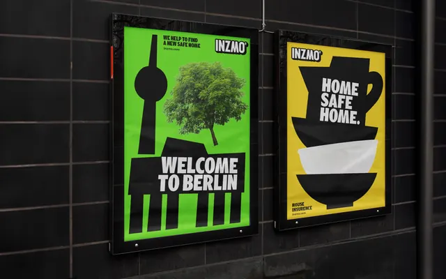
Two backlit street posters on a dark tiled wall, one green with a Berlin skyline glyph and a photographic tree, one yellow with stacked black crockery shapes.
More like this
See all

Summary
Two portrait posters in glass lightbox frames sit side by side on a black tiled wall, each running a single oversized black glyph on a fluorescent ground with short all-caps copy reversed out of it.
Visual description
The wall is dark grey-black rectangular tile with wide grout lines, shot at an angle so the left poster is larger and closer. The left poster is fluorescent green. A flat black composite skyline runs up its center: a slim tower with a sphere near the top, a pitched-roof gable and a colonnade of thick vertical bars across the bottom. Growing out of it at right is a full-color photographic tree canopy, cut out with visible leaf edges, the only realistic element on the sheet. "WELCOME TO BERLIN" is reversed in heavy white condensed caps across the black base block. Top left of that poster, small black caps read "WE HELP TO FIND A NEW SAFE HOME" with "inzmo.com" below; the black INZMO wordmark tab sits top right. The right poster is chrome yellow and carries a stack of black vessel silhouettes: a jug with a handle at the top, a wide black bowl, then a white bowl, then another black bowl below, forming a tapering tower. "HOME SAFE HOME." is set in three lines of white condensed caps over the upper shapes. Its INZMO tab sits top left, and small black caps at the bottom left read "HOUSE INSURENCE" with "inzmo.com". Both posters show slight paper waviness under the glass and reflections of bare trees and a building.
Key takeaway
Each poster is one silhouette, one color and one line of copy, and the type is always reversed out of the black shape rather than placed near it. Introducing exactly one photographic element into an otherwise flat vector composition gives the series a recurring trick without a template.
Reuse notes
A good pattern for a city-by-city or product-by-product poster run: keep the black glyph language and swap the fluorescent ground per subject. Needs fluorescent or near-fluorescent inks to hold up; muted colors would flatten the contrast the whole system rests on. Note the visible copy typo in the small print, worth checking before borrowing the layout wholesale.