Preview image. Unlock full-res
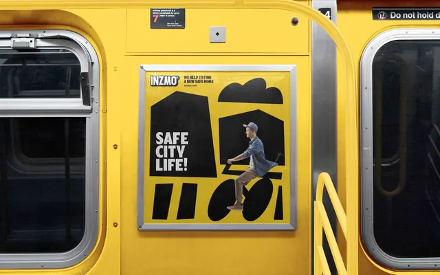
Framed transit poster on a yellow subway carriage, pairing flat black house and bicycle glyphs with a cut-out photograph of a cyclist and a three-line all-caps headline.
More like this
See all
Summary
A near-square poster in a metal frame sits on the yellow wall of a subway car between two door windows, running black cut-paper house shapes over a chrome yellow ground with a photographic cyclist riding through them.
Visual description
The environment is a yellow-painted train interior with brushed metal door frames, dark windows either side, a yellow grab rail at right and small printed transit notices above. The poster is bright chrome yellow. Across the top, the INZMO wordmark tab sits at left with small black all-caps copy beside it reading "WE HELP TO FIND A NEW SAFE HOME" and "inzmo.com". The composition below is built from flat black slabs: a tall angular house form at left, a second gabled house at right topped by a rounded cloud or tree mass, short black bars at the bottom standing in for a fence or railing, and two solid black ellipses that read as bicycle wheels. Riding across them, cut out photographically with a hard edge, is a young man in a grey flat cap, a denim shirt over a white tee, tan chinos and brown sneakers, leaning forward with hands on invisible bars so the black shapes complete the bike. Reversed out of the left house in heavy white condensed caps, stacked on three lines, is "SAFE CITY LIFE!". The poster surface carries a slight sheen and a small crease near the center.
Key takeaway
The black glyphs are drawn to be finished by the photograph: the bike has no frame until the rider supplies it. That dependency makes a flat two-color poster feel constructed rather than decorated, and the headline still reverses out of a shape instead of sitting on empty ground.
Reuse notes
Good for transit or commuter placements where the viewer is close and has time to decode the image. The trick needs a photograph shot for the artwork, with pose and eyeline planned around the glyph, so it is not a stock-image layout. The near-square car-card ratio also forces the headline into a narrow column, which suits three short words and little else.