Preview image. Unlock full-res
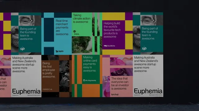
A wide wall of pasted posters in brand colors, each pairing a short "is awesome" statement with a portfolio company logo, bookended by two wordmark posters.
More like this
See all
Summary
An environmental frame of the campaign pasted as a poster wall in a dark space, where every sheet is a color-blocked panel carrying one short statement and one partner logo.
Visual description
The posters run in two rows across a dark wall, lit so the surrounding space stays almost black and the sheets read as a bright band. Each poster is built from the same modular color blocking: fields of teal, gold, purple, mint green, brown, orange, pink and pale grey butted together with hard edges. Copy is set in medium grotesque sans in dark or white, always a short sentence ending in "awesome": being part of the founding team, real-time merchant payments, taking climate action, helping build the world's favourite tech products, making online card payments easy, being the first employee, the idea that everyone can be an investor. A small company logo sits at the foot of each: Up, Zepto, trace., Buildkite, Pin Payments, Ferocia, Birchal. Several panels carry cropped imagery rather than flat color, greyscale close-ups of faces, foliage, rock and pink fabric. At both ends of the lower row, an identical grey poster closes the run with the large "Euphemia" wordmark, a small url and a line of small print. The repetition of that end panel on the left and right frames the whole wall.
Key takeaway
One sentence structure repeated across every poster does the campaign work, so the color blocking is free to change completely from sheet to sheet without the set falling apart. Repeating the wordmark poster at both ends turns a loose paste-up into a deliberate composition.
Reuse notes
Useful for launch campaigns, conference walls and out of home sets that must carry many partner or product names under one voice. The formula depends on a copy line short enough to set large and a logo small enough not to compete. Greyscale imagery is what lets photography sit in the mosaic without adding a competing palette.
More like this

Keep what you find
A free account saves references to boards and can send you a weekly email of picks based on what you save.
To see every result, go Pro.