Preview image. Unlock full-res
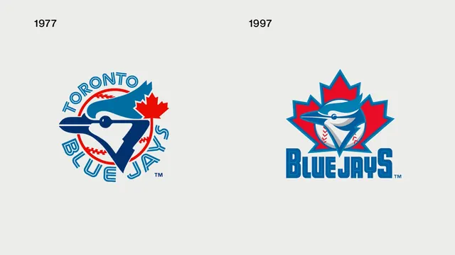
Side-by-side comparison of two Toronto Blue Jays logos labeled 1977 and 1997 on light gray.
Colorvibrant, light, high-contrast
Typesans-serif, display
Moodprofessional, friendly, bold
Industrymedia
Tagssports-logo, blue-jays, logo-evolution, mlb
Palette
#EBEBEB
#226799
#D61A29
Summary
Two Blue Jays marks show the 1977 circular bird-and-baseball badge beside the 1997 angular leaf-integrated logo.
Visual description
Black year labels sit above each mark on pale gray. The older logo uses a roundel with serif team name; the newer pairs a sharper jay head with a thick-bordered red maple leaf and shadowed BLUE JAYS type.
Key takeaway
Juxtaposing eras makes stylistic shifts in sports branding instantly legible.
Reuse notes
Reference for logo history posts, redesign case studies, or vintage-versus-modern identity debates.