Preview image. Unlock full-res
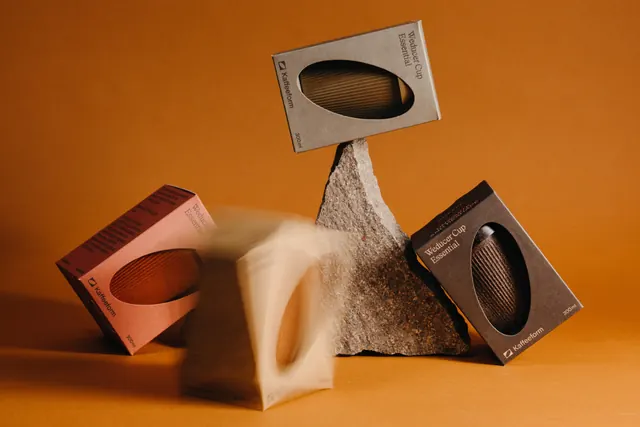
Four cup boxes in earth-toned board balanced around a raw stone block against an ochre backdrop, with one box captured mid-fall as a blur.
More like this
See all
Summary
A still life of Weducer Cup Essential boxes in four colorways, each cut with an oval window onto the ribbed cup inside, arranged around a chunk of rough stone on a warm ochre sweep.
Visual description
The background is a seamless ochre to amber sweep with a soft shadow pooling under the arrangement. A jagged grey and brown stone block stands upright in the center. Four rectangular boxes lean or balance around it: a grey kraft one propped on the stone's peak at a tilt, a terracotta pink one resting on its corner at left, a deep brown one at right, and a pale one in the foreground caught mid-motion as a soft blur. Every box carries a large oval die cut showing the fluted side wall of the cup, with the product name "Weducer Cup Essential" set in a light serif running vertically up the right edge, a small square mark plus the "Kaffeeform" wordmark in sans-serif at bottom left, and "300ml" in the lower corner. Small blocks of body copy sit vertically on the side faces. The box color and the cup color match within each pack, so the window doubles as a swatch.
Key takeaway
The oval die cut turns the pack into its own product shot and makes the colorway self-evident without a printed swatch. Letting one object stay in motion blur gives a static studio composition energy without props or retouching tricks.
Reuse notes
Reach for this when a physical product needs to be visible through the pack and the range is defined by color. The raw stone reads as a material cue and only works for brands with a genuine earthy or recycled story. The tilted balance and blur are hard to reproduce on a fast shoot schedule.
More like this

Keep what you find
A free account saves references to boards and can send you a weekly email of picks based on what you save.
To see every result, go Pro.