Preview image. Unlock full-res
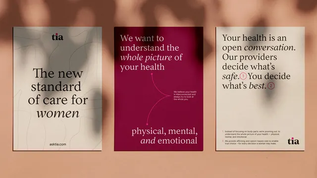
A three-panel brand campaign for women's-health brand Tia, alternating cream and deep-burgundy posters with a serif headline voice over a soft terracotta shadow-leaf backdrop.
Summary
Three brand posters for the women's-health brand "tia," shown side by side over a warm terracotta surface streaked with soft leaf shadows. The defining choice is a literary serif headline voice with italic emphasis words, reading more like editorial than medical marketing.
Visual description
The set sits on a peachy-brown background with dappled shadow. Left poster: cream card, lowercase "tia" wordmark top-center, headline "The new standard of care for women" in a high-contrast serif with "women" in italic, "asktia.com" footer. Center poster: deep burgundy, cream serif headline "We want to understand the whole picture of your health" with italic stresses, a thin hand-drawn curve, small body copy, and a bottom line "physical, mental, and emotional." Right poster: cream again, "Your health is an open conversation. Our providers decide what's safe. You decide what's best." with circled superscript numbers (1, 2) keying to small footnotes, and the "tia" mark bottom-right. The serif type and burgundy/cream/terracotta palette carry across all three.
Key takeaway
The serif-led, italic-emphasis editorial voice applied to healthcare, which sidesteps the usual clinical sans-serif and reads warm and human. Also the circled superscript numbers tying headline phrases to footnotes, a tidy way to add credibility detail without cluttering the main statement.
Reuse notes
Ideal for healthcare, wellness, or DTC care brands aiming for a premium, trustworthy, editorial feel rather than a sterile one. The warm earthy palette and shadow-backdrop staging suit campaign posters, OOH, and social. Pairs well with photography in the same muted tones; the serif voice needs real copy to carry it.
More like this




Keep what you find
A free account saves references to boards and can send you a weekly email of picks based on what you save.
To see every result, go Pro.