Preview image. Unlock full-res
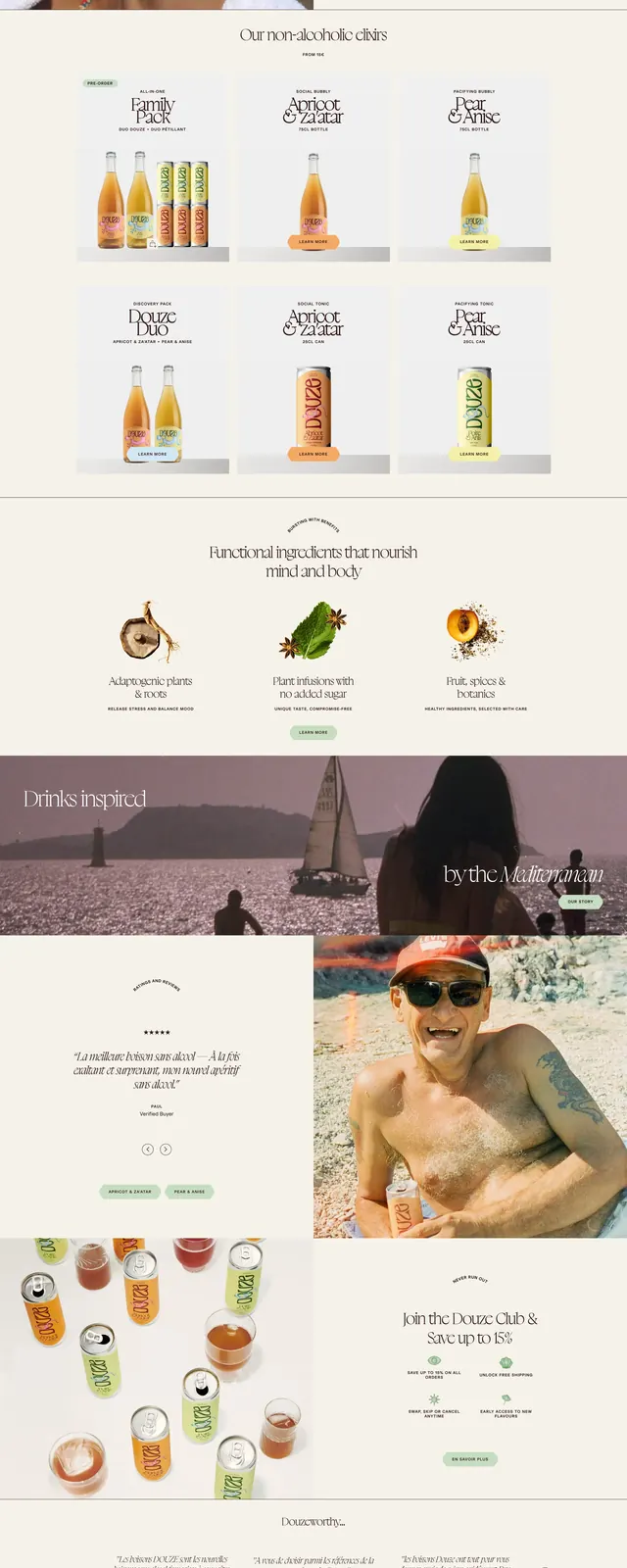
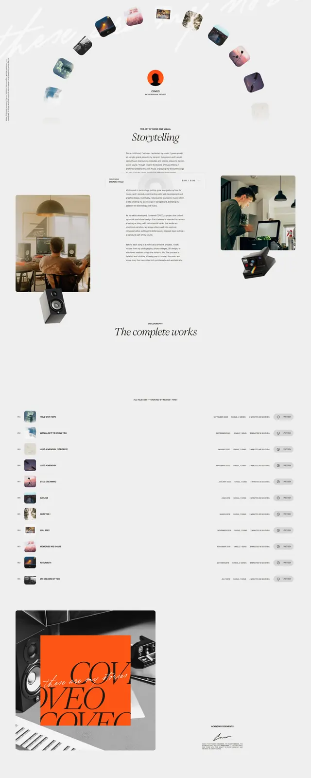
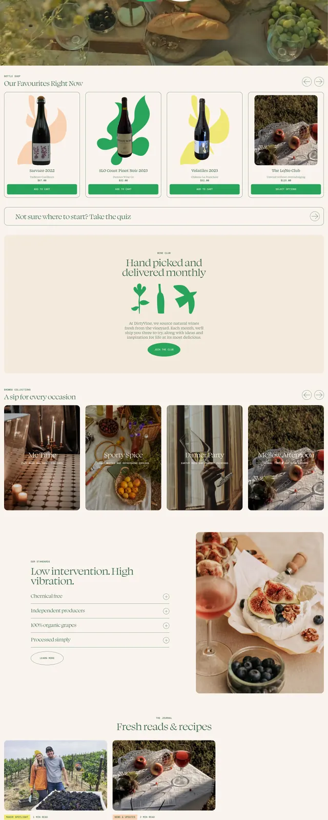
An earthy, editorial ecommerce homepage for a wine and botanical beverage brand with soft cream backgrounds, serif type, and immersive lifestyle photography.
Summary
An earthy, editorial ecommerce homepage for a wine and botanical beverage brand with soft cream backgrounds, serif type, and immersive lifestyle photography.
Visual description
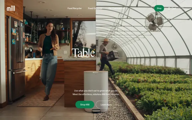
The page opens with a full-bleed hero image of a rustic outdoor table setting with wine, fruit, bread, and greenery, overlaid by a centered serif headline and two rounded call-to-action buttons. Below, product and collection sections use bordered cards, carousel arrows, and large lifestyle imagery on a soft cream canvas. Further down, a newsletter/editorial footer area includes a small input field, minimal links, and a restrained footer layout. The overall composition feels airy, tactile, and boutique, with botanical illustrations and natural textures repeated throughout.
Key takeaway
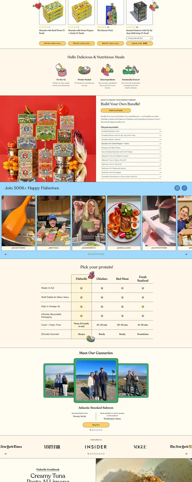
Use generous cream space, high-end serif headlines, and warm lifestyle photography to make a food or beverage brand feel artisanal and premium. The repeated card grids and collection carousels make the layout easy to adapt for product discovery.
Reuse notes
This pattern works well for DTC beverage, specialty food, or farm-to-table brands that need both storytelling and shopping. Keep the UI minimal so the photography and product packaging remain the focal point.