Preview image. Unlock full-res
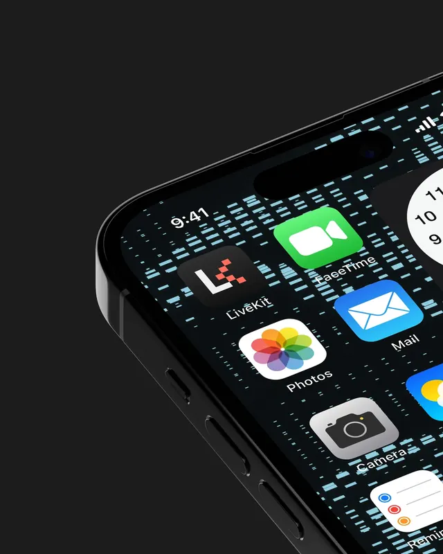
A tight render of a phone corner where the LiveKit app icon sits among stock iOS icons over a wallpaper of pale blue data dashes.
More like this
See all

Summary
A very close, angled phone render that proves the app icon by placing it directly beside familiar stock iOS icons, over a custom wallpaper made of scattered pale blue dashes.
Visual description
The frame is cropped hard to the upper left corner of a black phone, tilted so the side buttons, the rounded chassis edge and the camera cutout all catch a thin highlight against a flat charcoal background. The wallpaper behind the icons is black, covered in short horizontal light blue bars of varying length and density, suggesting packets or a waveform read at low resolution. On the grid, the LiveKit icon sits top left, a dark rounded square holding a white blocky L with a small cluster of coral squares stepping away from its corner. Around it are stock icons, FaceTime in green, Mail in blue, Photos, Camera and Reminders, plus part of a white circular clock widget at the right edge. The status time reads 9 41 and labels sit in white below each tile.
Key takeaway
Showing a new icon in the wild next to Apple's own icons is the honest test, and this one passes by staying dark and reserved where the stock set is saturated. The wallpaper pattern extends the brand past the icon without competing with it.
Reuse notes
A strong template for presenting an app icon in a case study, since the crop forces attention onto one tile rather than a full tidy home screen. It relies on using real stock icons for contrast, which is fine for internal review but needs care in published work. Only relevant when the product actually ships a mobile app.