Preview image. Unlock full-res
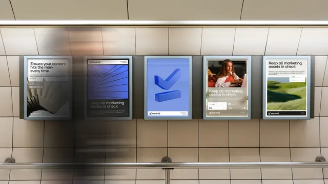
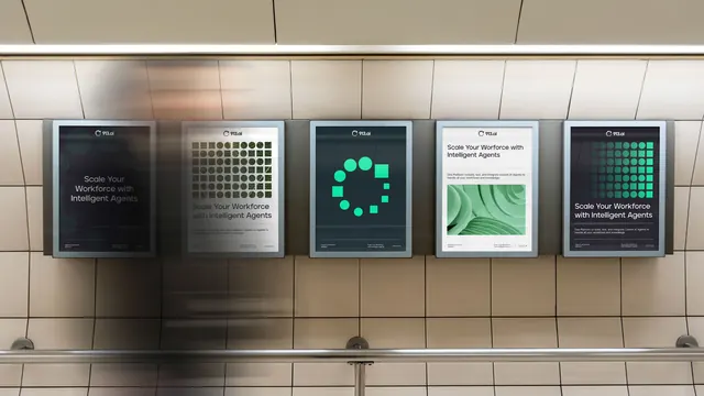
Five backlit poster frames in a tiled transit corridor running a Mark OS campaign of headline panels, a 3D blue tick and photo posters overlaid with UI stat cards.
More like this
See all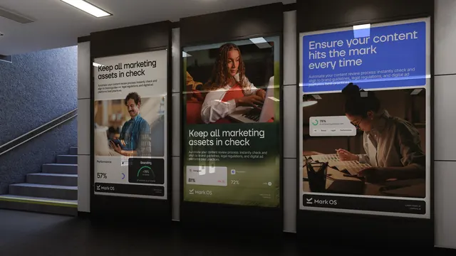
Summary
A five-panel out-of-home campaign in a station corridor, showing how one poster template flexes between headline, product render, photography and interface proof.
Visual description
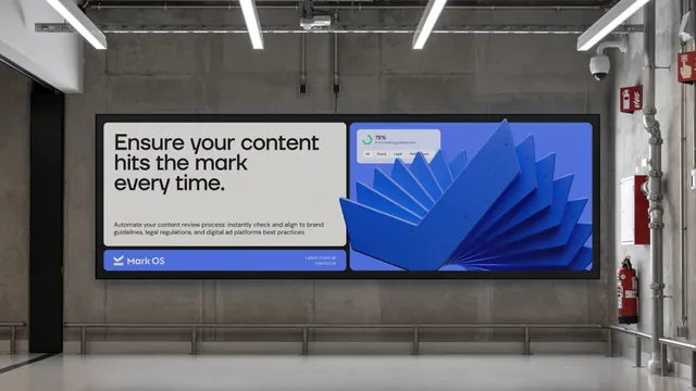
Five lightbox frames hang in a row on a beige tiled wall above a chrome handrail, one partly veiled by a motion-blurred passer-by at the left. Each poster shares the same skeleton: a footer bar carrying the chevron mark and "Mark OS" at the left with a small "Learn more at markos.ai" at the right, and a stacked headline plus two lines of sub-copy. The first is off-white with black type reading "Ensure your content hits the mark every time" over a greyscale render of fanned overlapping plates and a small interface card. The second is dark, with a blue render of nested chevron lines occupying the upper two thirds and grey type "Keep all marketing assets in check" below. The third is a saturated blue field holding a single 3D extruded tick, its two strokes separated and casting soft shadow, with a white footer bar. The fourth overlays the same headline on a warm photograph of a person at a laptop, plus a translucent card showing two platform metrics at 81 percent and 72 percent. The fifth is white with the headline at the top, sub-copy beneath, and a photo of green grass carrying a card reading 75 percent of brand guidelines met.
Key takeaway
One footer bar and one type hierarchy hold five very different treatments together, so the campaign scans as a family from across a platform. Dropping a real product UI card onto photography turns an abstract claim into visible proof without a screenshot of the whole app.
Reuse notes
A useful model for B2B software taking a campaign into physical or display media, where a viewer has only a couple of seconds. The consistency lives entirely in the footer lockup and the type scale, so those must be locked before the variants are designed. The UI cards need to stay legible at poster distance, which means one metric per card at most.