Preview image. Unlock full-res
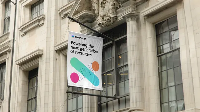
White projecting banner on a classical stone facade carrying a three-line strapline above a teal cross flanked by solid circles and a dot field.
More like this
See all

Summary
A white fabric banner hung from a bracket on an ornate limestone facade, stacking the logo lockup, a three-line strapline and a single teal-to-blue cross with two solid circles and a diagonal dot field.
Visual description
The building is pale carved stone with tall multi-pane sash windows, fluted pilasters and a heavy carved crest above the central bay. A black steel bracket projects from between two windows and carries a portrait banner on guy wires, so the fabric hangs with a slight curve and visible tension folds along its edges. At the top of the banner, the dot-cluster mark and "xrecruiter" wordmark sit small in black. Below, "Powering the next generation of recruiters" runs in three left-aligned lines of black rounded sans at moderate size. The lower two thirds of the banner hold a single diagonal bar with rounded ends running from lower left to upper right, filled with a green to teal gradient, and a shorter bar crossing it from upper left to lower right, forming the X. A solid magenta circle sits at the lower left and a solid orange circle at the upper right. A grid of small navy dots runs diagonally between the two bars, following the same angle. Everything sits on a plain white ground with generous margins.
Key takeaway
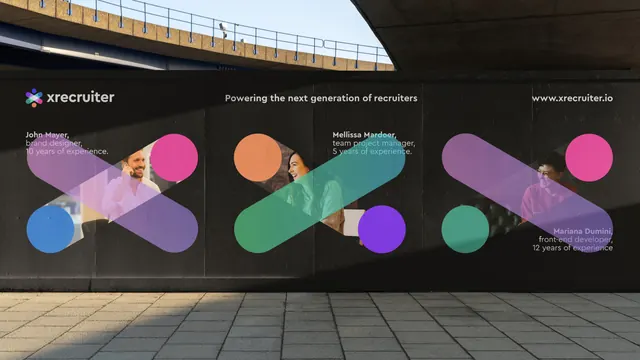
Reducing the identity to one X, two circles and a dot field lets a small banner read from street level, where the hoarding version of the same system would turn to mush. Repeating the diagonal of the bars in the dot field gives the composition a direction and fills the empty half of the banner without adding another element. Placing a bright, flat, modern graphic against carved heritage stone is the whole contrast play.
Reuse notes
Good for venue banners, office frontages and conference wayfinding where the mounting is fixed and the viewing distance is long. The white ground is what makes it legible against stone; on a dark facade the same layout would need inverting. Fabric banners crease and curve, so avoid placing type near the outer edges where the fold distortion is worst.