Preview image. Unlock full-res
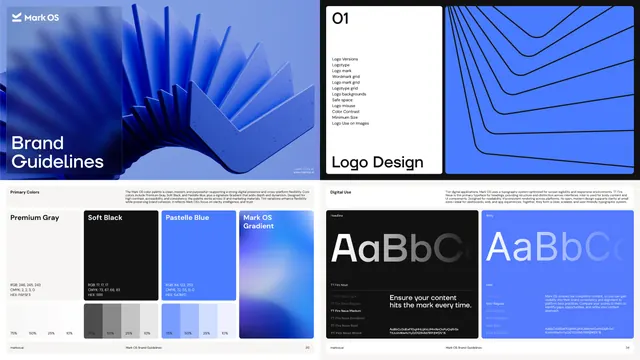
Four brand guideline pages showing the Mark OS cover, a logo design contents page, the primary colour swatches with tint scales and the digital typography specimen.
More like this
See all

Summary
Four pages of the guidelines document laid out two by two, running from the 3D cover through the logo section divider to the colour and typography specifications.
Visual description
The top left page is the cover: a cobalt render of thin rounded plates fanning out across the frame, with a frosted panel at the left carrying the chevron mark, "Mark OS", and "Brand Guidelines" in white sans-serif over two lines. The top right is a section divider split down the middle, a white half numbered "01" at the top with a list of subsections beneath, from logo versions through safe space and minimum size to logo use on images, and "Logo Design" set large at the bottom, next to a cobalt half with black nested chevron lines. The lower left page is the primary colour spec: a short explanatory paragraph, then four swatch blocks labelled Premium Gray, Soft Black, Pastelle Blue and Mark OS Gradient, each with RGB, CMYK and HEX values, and below three of them a row of tint chips at 75, 50, 25 and 10 percent. The lower right page covers digital typography: a black card showing a huge grey "AaBbCc" with the weight list for the headline face and a sample line of copy, beside a cobalt card showing the same specimen and weight list for the body face. Every page carries a thin footer with the url, the document name and a page number.
Key takeaway
Setting the specimen twice, once on black and once on brand blue, proves the type survives both surfaces in one glance. Pairing each colour with its tint ramp directly underneath saves a separate page and makes the usable range obvious.
Reuse notes
A clean template for software and AI brand books where the palette is small and most of the value is in precise specification. Works best when there really are only three core colours plus a gradient, since the four-across swatch row would break with more. The frosted panel on the cover depends on having a rich render behind it.
More like this




Keep what you find
A free account saves references to boards and can send you a weekly email of picks based on what you save.
To see every result, go Pro.