Preview image. Unlock full-res
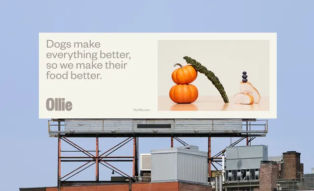
A cream rooftop billboard splitting a four-line taupe headline and heavy wordmark on the left against a warm still life of pumpkins, kale, chicken and blueberries on the right.
More like this
See all

Summary
A wide cream billboard on a city rooftop, split into a taupe headline and wordmark on the left and a bright ingredient still life on the right.
Visual description
The billboard occupies the upper half of the frame against a clear pale blue sky, mounted on a weathered steel gantry above a brick building with air handling units and a chimney below. Its face is a warm off-white. On the left sits a four-line headline in a soft geometric sans-serif, ranged left, set in a muted taupe rather than black, followed by a gap and then the wordmark in the same taupe at much heavier weight, wide and tightly spaced. On the right a photograph in a slightly cooler off-white sits inset with generous margin: two small orange pumpkins stacked one on the other, a long curved leaf of dark green kale leaning against them, and to the right three blueberries stacked on top of two slices of roast chicken, all lit warmly on a pale wooden surface with soft cast shadows. A small url sits in taupe at the lower edge between the two halves.
Key takeaway
Setting both the headline and the wordmark in a muted taupe instead of black keeps the whole board in the same warm register as the food photograph, so the type never feels bolted on. The ingredients are stacked into little vertical towers, which turns a plain product shot into a composition legible from a distance.
Reuse notes
A useful reference for food or pet brands that want warmth without saturation, and for billboards where the headline is long enough to need four lines. The low-contrast taupe on cream is only safe at this scale with clean sky behind; drop it to small print or a busy backdrop and it will fail legibility. Pairs well with the same still-life treatment carried into packaging and social.