Preview image. Unlock full-res
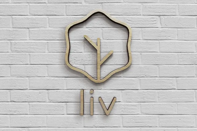
The leaf mark and lowercase wordmark laser cut from pale plywood and mounted off a white painted brick wall.
More like this
See all
Summary
The primary lockup fabricated in pale wood as separate cut pieces, floated off a white brick wall so every stroke throws its own shadow.
Visual description
A straight-on shot of a white painted brick wall filling the frame, its mortar lines and paint texture clearly visible. Centred on it, the leaf mark is cut as a single closed ribbon: an open wavy hexagon outline with a slight hand-drawn wobble to each side, enclosing a simple two-branch twig that runs from the bottom of the outline up through the middle. Below it sits the lowercase wordmark, the three letters l, i and v cut as individual pieces with the dot of the i as a separate disc. Everything is cut from the same pale birch-toned plywood with the edge grain visible on each stroke, and each piece is stood off the wall so a soft shadow falls down and slightly right. The wall is lit evenly with a gentle falloff toward the corners, and no other element appears in the frame.
Key takeaway
Cutting an outline mark from a single continuous ribbon of ply means the negative space stays open and the wall becomes the fill, so the sign never needs a background panel. Standing the letters off the surface gives a flat logo depth using only shadow.
Reuse notes
Reach for this when a brand needs an interior sign that reads as handmade and natural rather than corporate. Requires a monoline mark of even stroke weight, since ply cuts poorly at thin tapers. The pale wood on white is quiet by design, so it needs good directional light to separate from the wall.
More like this





Keep what you find
A free account saves references to boards and can send you a weekly email of picks based on what you save.
To see every result, go Pro.