Preview image. Unlock full-res
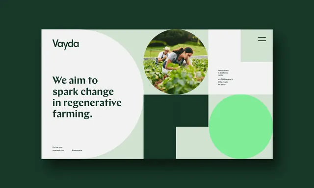
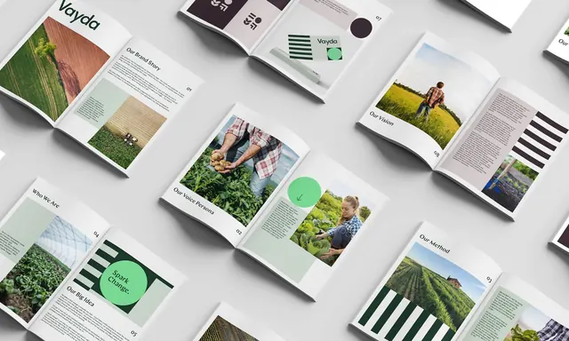
Mockup of the Vayda brand book, multiple open booklets and a stationery spread arranged on a light grey surface at a shared diagonal.
More like this
See all


Summary
An overhead mockup of the printed brand book, with eight or so open booklets tiled across a pale grey surface, all rotated to the same diagonal so the spreads read as one continuous grid.
Visual description
Soft shadows sit under each booklet and the surface is even light grey. The cover shows the wordmark above a full-bleed aerial photograph of a field split between green crop and bare earth. Interior spreads carry a running pattern: a rotated section title at the outer edge, a two-digit page number, a block of justified body copy in a serif, and an image or colour panel. Visible titles include "Our Brand Story", "Our Voice Persona", "Our Vision", "Our Method", "Who We Are" and "Our Big Idea". Recurring devices appear across spreads: the mint circle used as a highlight, a downward arrow inside it, blocks of dark green and white stripes, pale sage tint panels, and documentary photographs of farmers holding potatoes, tending cabbages and standing in a field. One spread near the top shows the symbol on a mauve tint alongside stationery, a business card carrying the wordmark on a striped panel, and a slim mint pen or ruler.
Key takeaway
Rotating every piece to the same angle turns a set of separate spreads into a single composition, so the pattern of the layout system is legible before any page is read. The rotated section title at the page edge is what makes each spread identifiable at a glance.
Reuse notes
Ideal for a case study frame that has to prove depth of a printed system without zooming into any one page. Requires enough spreads to fill the frame and a consistent page architecture, otherwise the angled tiling exposes the inconsistency. Body copy is deliberately unreadable at this scale, so pair it with a detail shot if the typography needs to be assessed.