Preview image. Unlock full-res
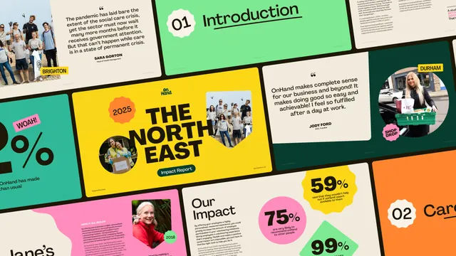
Angled tiled grid of OnHand impact report slides, mixing cream quote pages, colour-blocked stat callouts and a yellow cover reading "The North East".
More like this
See all

Summary
A dozen impact report pages tiled edge to edge and rotated a few degrees, showing how one colour-blocked layout system flexes between quotes, statistics, section dividers and photography.
Visual description
The whole frame is a grid of landscape slides butted together with thin white gutters and tilted roughly five degrees clockwise, so the outer pages are cropped by the frame. The hero page sits centre left: a saturated yellow field with the stacked On Hand logotype at the top, an orange starburst badge reading "2025" on the left, "THE NORTH EAST" set very large in black all-caps display type over three lines, two circular photograph cutouts of volunteers dropped into the type block, and a dark green pill labelled "Impact Report" beneath. Around it: a cream page pairing a photograph of a volunteer group with a rotated pull quote about the social care crisis, attributed to a named head of health management, with a yellow "BRIGHTON" tag; a mint green page with a cream starburst numbered "01" and "Introduction" in a handwritten-looking underlined script; a cream page with a second testimonial quote and a "DURHAM" location tag beside a photo of a woman loading a car, marked with a pink "SHOP DROP" badge; a teal page carrying an oversized percentage figure with a pink "WOAH!" flash; a page headed "Our Impact" in two lines of large green type beside pink, yellow and green stat shapes reading 75%, 59% and 99%; and a pink page with dense body copy under "HOW IT ALL BEGAN" next to a portrait and a small "2018" tag. Colour blocks are solid and flat, photographs are always cut into circles or soft blobs, and every page keeps wide margins.
Key takeaway
Statistics are given their own shape rather than a chart: each figure sits in a starburst, circle or diamond of flat colour, which makes a report scannable and gives the deck rhythm. Rotating the contact-sheet grid turns a set of ordinary slides into a single energetic image for a case study.
Reuse notes
Strong reference for a nonprofit or purpose-led annual or impact report that has to feel optimistic rather than corporate. The system needs a wide colour palette and generous white space to stop the badges reading as clutter. The angled presentation is for showing the work; individual pages would be set straight.