Preview image. Unlock full-res
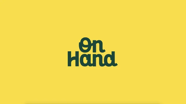
The OnHand logotype set in a chunky rounded green sans, stacked over two lines and centred on a flat sunflower yellow field.
More like this
See all

Summary
A two-line logotype presented on its own: heavy rounded green letterforms on a flat yellow ground, with the two words locked tightly enough to read as a single shape.
Visual description
The whole frame is a flat warm yellow with a very slight vignette darkening the bottom corners. Centred and occupying roughly a fifth of the width, the logotype reads "On" on the upper line and "Hand" on the lower line, both in a deep bottle green. The letterforms are custom and heavy: rounded terminals, very tight counters, and small angled cuts where strokes meet so each junction has a wedge of negative space. The capital O is nearly circular with a small oval counter, and the capital H on the second line has a low crossbar. The two words are set at different widths but their optical mass is matched, and the descender-free baseline of "On" sits directly on the cap height of "Hand" so the block closes up with almost no leading. Nothing else appears in the frame: no mark, no tagline, no strapline, no legal line.
Key takeaway
Wedge-shaped cuts at every stroke junction keep a very heavy rounded face from turning into mush, and they give the type a hand-cut warmth that a plain geometric sans would not have. Stacking the two words with zero leading turns a wordmark into a compact badge that will hold at small sizes.
Reuse notes
Suits purpose-led, friendly brands that need to feel approachable without going handwritten. The two-colour, one-weight construction makes it easy to reverse or apply to merchandise and packaging. The tight counters mean it will fill in at very small sizes or in low-resolution embroidery, so a spaced-out secondary version would be worth having.