Preview image. Unlock full-res
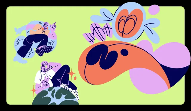
A wide lime illustration pairing loose navy line drawings of seated figures with large flat blob forms in coral, lilac and pale blue.
More like this
See all
Summary
A text-free illustration panel that sets out the brand's drawing language: thin navy contour figures floating in soft colour halos, next to large flat blob shapes that read as abstract sweetness.
Visual description
A rounded-rectangle lime green panel fills the frame against a black surround. Top left, a reclining figure is drawn in thin navy line with lilac and peach patches for skin and clothing, dark navy trousers and striped sneakers, sitting inside a pale blue amoeba-shaped halo with four-point sparkle marks around it. Lower left, a second figure in a white top and navy skirt sits on the curve of a stylised globe rendered in deep teal-green and pale blue, with coral sparkles beside it. The right half is given to flat shapes: a large coral form outlined in navy that sweeps from the centre to the right edge with two navy blob shapes and a small navy dot sitting inside it like an abstract face, a lilac mass behind it that runs off the right edge, a wrapped candy drawn in lilac with navy hatching, and a pale blue circle containing a coral oval with looping navy scribbles. All edges are hand-drawn rather than geometric, and every shape is flat with no shading or gradient.
Key takeaway
Two drawing modes coexist because they share one line: the figures are outline with colour patches, the shapes are flat fills, and the same navy contour ties them together. Leaving the panel entirely free of type makes it a reusable background rather than a finished piece.
Reuse notes
A good pattern library for a food or wellness brand that wants illustration to feel handmade without going twee. The lime ground is aggressive, so the same artwork should be tested on the softer peach and pale blue grounds in the system. Because there is no type here, expect to reserve the empty lime areas for headlines when this is used as a poster or social base.
More like this
Keep what you find
A free account saves references to boards and can send you a weekly email of picks based on what you save.
To see every result, go Pro.