Preview image. Unlock full-res
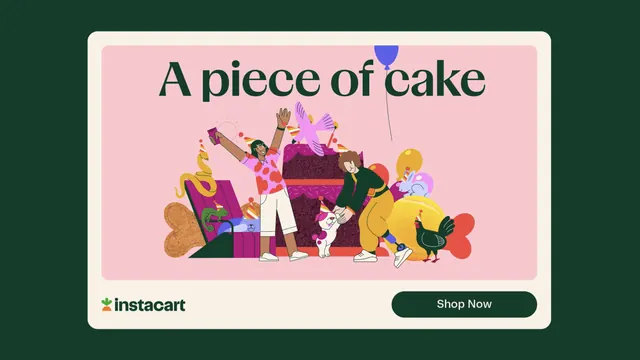
Digital ad frame on dark green with a cream card holding a serif headline, a crowded pink birthday illustration and a Shop Now pill.
More like this
See all
Summary
A birthday-themed ad frame where a cream rounded card sits on deep green, carrying a green serif headline over a dense pink party illustration with the lockup and a CTA pill beneath.
Visual description
Deep forest green fills the outer frame. Inside it a large cream card with big corner radii holds a second, nested pale pink panel. Across the top of the pink panel runs "A piece of cake" in dark green high-contrast serif with sharp bracketed terminals, lowercase except the A, set nearly edge to edge. Below, a flat vector scene: a giant magenta layer cake with a dark crumb texture and pink sprinkle marks anchors the center. A person in a red-spotted pink shirt, white shorts and a striped party hat throws one arm up and holds a magenta phone with radiating lines; a second figure in a black top and mustard trousers bends to pat a small white dog in a party hat. Around them: a pink bird mid-flight, a green lizard and a blue cat inside an open magenta gift box, a rabbit, a black chicken in a party hat, yellow balloons, a red heart shape and a tan bone biscuit, with a single blue balloon on a thin string floating up into the headline. Beneath the pink panel, the carrot mark and green "instacart" wordmark sit bottom left; a dark green pill button reading "Shop Now" in cream sits bottom right.
Key takeaway
The nested card inside a card gives the ad two clean frames of breathing room, so a very busy illustration never touches the type or the CTA. Pairing a refined serif headline with loud flat vector characters is what stops the whole thing reading as a kids' promo.
Reuse notes
Good model for a seasonal or occasion-led ad unit where the illustration has to carry a lot of subjects. The layout scales down poorly if the headline gets longer than four or five words. Works best when the illustration palette is deliberately narrowed, here to magenta, pink, mustard and green.
More like this
Keep what you find
A free account saves references to boards and can send you a weekly email of picks based on what you save.
To see every result, go Pro.