Preview image. Unlock full-res
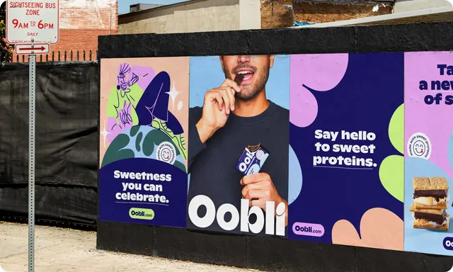
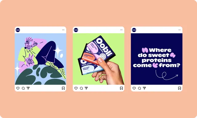
Four campaign posters wheatpasted side by side on a black construction hoarding, alternating illustration, portrait photography and pure type.
More like this
See all
Summary
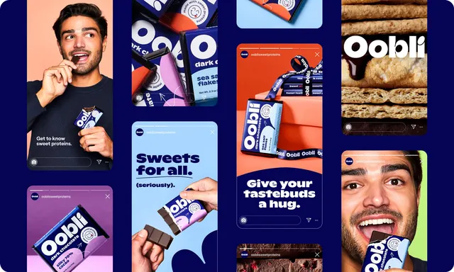
An in-situ shot of a four-poster campaign run pasted flush across a black street hoarding, showing how the same palette carries across illustrated, photographic and typographic executions.
Visual description
The photograph is taken at a slight angle from the pavement. A parking sign reading SIGHTSEEING BUS ZONE 9AM TO 6PM stands at the left, and brick and plywood buildings sit behind. The hoarding is painted matte black with a black capping rail, and four posters are pasted edge to edge across it. Poster one has a peach top half with a loose line-drawn figure in lilac, lime and deep navy seated on a stylised green globe, sparkle marks around it, a small circular made with sweet proteins stamp with a smiling tongue-out face, then a navy lower block carrying Sweetness you can celebrate. in white with an underlined lime Oobli.com pill beneath. Poster two is a cropped portrait on pale blue: a bearded man in a black sweatshirt biting a square of dark chocolate, holding an opened navy and pale blue bar; the word Oobli runs across the bottom in very large white lowercase with a soft, rounded geometric feel. Poster three is navy scattered with lilac, lime and peach blob shapes, carrying Say hello to sweet proteins. in white with a lilac Oobli.com pill lower left. Poster four is cropped by the frame edge, showing lilac and blue panels, a partial headline, another stamp and a s'more stacked with marshmallow and chocolate.
Key takeaway
Four completely different poster types stay recognisable as one campaign because only three things are held constant: the navy, the blob vocabulary, and the lozenge-shaped Oobli.com endcap. Rotating the content type across adjacent placements gives a run of posters variety without needing more colours.
Reuse notes
Good reference for planning an out-of-home run rather than a single poster, and for how a consumer food brand can mix illustration and photography without the two fighting. The black hoarding does a lot of separating work; against a light wall the same posters would need borders. The lowest headline lines sit close to the pavement, so real-world sight lines should be checked.