Preview image. Unlock full-res
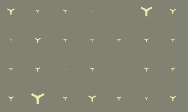
A scattered grid of pale chartreuse tri-radial marks at different sizes on a flat olive field, used as a brand pattern.
More like this
See all

Summary
A flat olive field carrying the brand's tri-radial mark repeated roughly seven across and four down, each instance rendered at a different size so the grid reads as a population rather than a wallpaper.
Visual description
The background is a single desaturated olive grey with no gradient or texture. On it sit pale chartreuse marks shaped like a three-armed Y: two arms angling up and out, one stem dropping straight down, all with squared-off ends and slightly thickened joints. Positions follow an even grid with generous air between rows, but scale varies sharply from instance to instance, from tiny specks barely a few pixels across to two or three marks four or five times larger. The largest sit in the top-right and lower-left, so weight is distributed diagonally rather than centred. Only two colours are used and there is no type, rule, or frame.
Key takeaway
Holding position on a strict grid while letting scale vary freely turns a single symbol into a system with depth and rhythm. The two-colour restraint keeps it usable as a background layer instead of competing with content placed over it.
Reuse notes
Good reference for building a brand pattern out of an existing logo mark without redrawing anything, and for backgrounds, endpapers, or packaging fills. The wide size range needs a large canvas to read; at small crops the tiny instances disappear and the pattern collapses into scattered dots.
More like this





Keep what you find
A free account saves references to boards and can send you a weekly email of picks based on what you save.
To see every result, go Pro.