Preview image. Unlock full-res
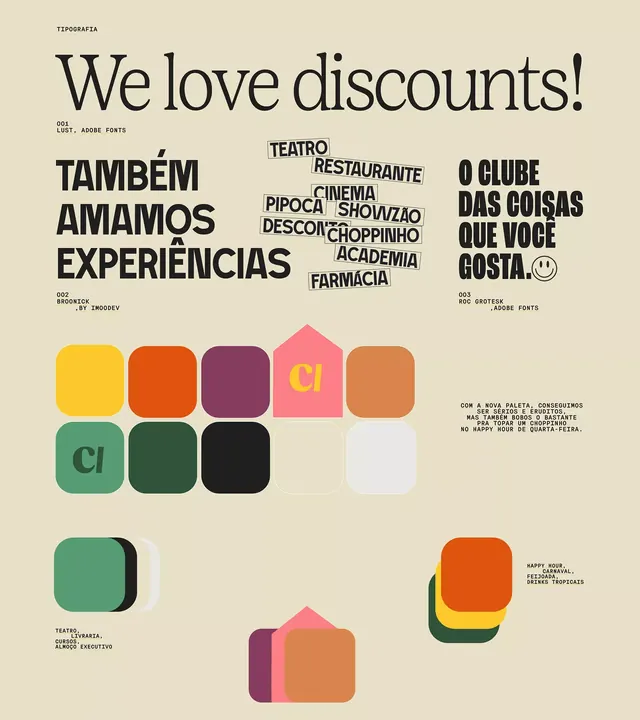
Type specimen showcasing three Portuguese fonts paired with a warm, earthy rounded-square color palette over cream background.
Summary
Type specimen displaying three Portuguese fonts (Lust, Bronxix, Roc Grotesk) paired with a warm color palette of earthy tones and geometric rounded-square swatches, organized on a cream background.
Visual description
The layout divides the page into three sections: top left shows large bold sans-serif type setting "TAMBÉM AMAMOS EXPERIÊNCIAS" in dark brown; center displays multiple restaurant/venue names in a stacked, overlapping composition with varied font weights (TEATRO, RESTAURANTE, CINEMA, CHOPPINHO, ACADEMIA, FARMÁCIA); right side shows "O CLUBE DAS COISAS QUE VOCÊ GOSTA" with a smiley emoji. Below is a 3x3 grid of rounded-square color swatches in mustard, burnt orange, plum, hot pink, terracotta, teal, forest green, and black, some labeled with "CI". Small text snippets in Portuguese appear alongside, discussing the new palette and its versatility. The overall composition balances typography samples with structured color blocks on a warm cream background.
Key takeaway
The pairing of sturdy display typefaces with a limited warm earth-tone palette organized as geometric swatches; the overlapping/stacked type technique to show how fonts interact; the rounded-square swatch format as an alternative to traditional color chips.
Reuse notes
Ideal for hospitality branding, restaurant identity systems, or type/color palette presentations targeting Portuguese or Latin American markets. The warm earthy palette works well for food, travel, or lifestyle brands. The swatch grid format transfers directly to brand guidelines or design system documentation.
More like this




Keep what you find
A free account saves references to boards and can send you a weekly email of picks based on what you save.
To see every result, go Pro.