Preview image. Unlock full-res
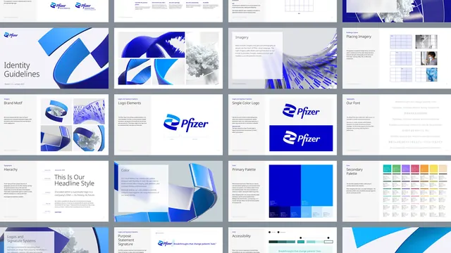
Grid of Pfizer identity guideline pages laid out as a contact sheet, covering logo elements, imagery, typography, colour and accessibility.
More like this
See all
Summary
An overview sheet of a corporate identity manual, showing roughly twenty guideline pages tiled four across so the whole document reads as one system.
Visual description
Landscape frame with a mid grey background and white landscape pages tiled in four columns and five rows, cropped at the top and bottom edges. Every page uses the same skeleton: a small blue eyebrow label at the top left, a large section title beneath it in a light-weight sans, a short justified paragraph of body copy under that, and the demonstration artwork occupying the right two thirds. Visible section titles include "Identity Guidelines" on a cover page with a large blue ribbon render, "Imagery", "Placing Imagery", "Brand Motif", "Logo Elements", "Single Color Logo", "Our Font", "Hierachy", "Color", "Primary Palette", "Secondary Palette", "Logos and Signature Systems", "Purpose Statement Signature" and "Accessibility". The artwork alternates between 3D renders of a glossy blue helical ribbon wrapped around a white molecular cluster, blue-toned science and portrait photography, wireframe layout diagrams with faint blue column grids, and colour chip charts. The typographic pages show the wordmark "Pfizer" in a blue italic script-like logotype, a headline specimen reading "This Is Our Headline Style", and a multilingual specimen running the same sentence in Russian, Chinese, Portuguese, Korean, Japanese and Dutch. The accessibility page shows contrast pairings as swatch bars with dot markers. Blue is the only saturated colour anywhere except the secondary palette page, which introduces a row of muted greens, ochres, corals and mauves.
Key takeaway
Presenting a manual as a full contact sheet, rather than a few hero spreads, sells the depth of the system in one image. The rigid page skeleton of eyebrow, title, short paragraph and right-hand artwork is what makes twenty pages of very different content read as one document.
Reuse notes
Reach for this when a case study needs to prove the scale of a guidelines deliverable, or as a structural reference when laying out a manual of your own. The individual pages are illegible at this size, so it works as a system shot only and needs detail frames alongside it. The multilingual type specimen is a useful pattern for any global brand.
More like this


Keep what you find
A free account saves references to boards and can send you a weekly email of picks based on what you save.
To see every result, go Pro.