Preview image. Unlock full-res
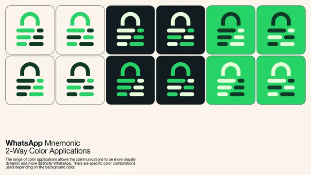
A guidelines page showing twelve versions of the lock mnemonic across cream, near-black and green tiles, each using a two-tone split of the symbol.
More like this
See all
Summary
A specimen sheet of twelve mnemonic tiles laid out as two rows of six, working through the approved two-colour combinations for each background.
Visual description
The ground is warm cream. The tiles are rounded squares of equal size, butted close with narrow gutters, arranged as six columns by two rows. Columns one and two are cream with a hairline dark border, columns three and four are near-black with a deep green cast, and columns five and six are bright green. Inside each tile sits the lock mnemonic: an arched shackle above three rows of stacked rounded bars, each row a long bar plus a short one. The point of the sheet is that the shackle and the bars are coloured independently, so each tile shows a different split. On the cream tiles the top row runs bright green shackle with green and dark bars, and the bottom row runs dark green shackle with mixed dark and green bars. On the black tiles the shackle switches between pale mint and bright green with the bars alternating between the two. On the green tiles the shackle switches between dark forest and pale mint with the bars mixing dark and near-white. Beneath the grid, flush left, sits the heading "WhatsApp Mnemonic / 2-Way Color Applications" with the brand name in bold, followed by three lines of small explanatory copy about the colour combinations varying with background. The lower right half of the page is left empty.
Key takeaway
Splitting one symbol into two independently coloured parts turns a single mark into a whole family without redrawing anything. Presenting all approved combinations as one uninterrupted grid makes the rule self-evident, so the caption only has to confirm it.
Reuse notes
The page to copy when a guideline needs to show permitted colourways rather than describe them. Works for any mark with two or more separable components. The generous empty space at the foot leaves room for do-and-do-not examples on the same spread. Note that some pairings here are low contrast by design, so this sheet should be read alongside a minimum-contrast rule.
More like this



Keep what you find
A free account saves references to boards and can send you a weekly email of picks based on what you save.
To see every result, go Pro.