Preview image. Unlock full-res
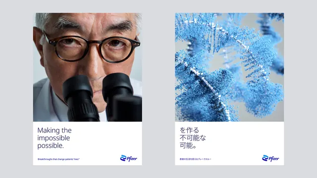
Two portrait campaign posters side by side, one photographic and one rendered, sharing an image-over-white-caption structure across two writing systems.
More like this
See all

Summary
A localisation pair: the same poster skeleton of full-width image above a white caption band, filled once with a scientist portrait and English copy and once with a molecular render and Japanese copy.
Visual description
Landscape frame on a flat light grey ground with two portrait posters set side by side, evenly spaced, with wide margins. Both are built the same way: roughly two thirds image at the top, one third flat white below, and inside the white band a headline top left, a small blue strapline at the bottom left and the Pfizer lockup at the bottom right. The left poster shows a tight portrait of an older scientist in tortoiseshell glasses and a white coat looking up from a black binocular microscope, the eyepieces cutting into the lower third of the frame. Its headline reads "Making the impossible possible." on three ranged-left lines in a navy light-weight sans, with the strapline "Breakthroughs that change patients' lives" beneath in small blue type. The right poster replaces the photograph with a render of a blue particle structure, thousands of small spheres forming branching strands against grey, and sets the same message in Japanese on three lines with a Japanese strapline below. Both carry the blue ribbon mark and italic logotype at the lower right. No borders or rules anywhere; the white band is the only separator.
Key takeaway
Fixing the proportion of image to white band, and the position of headline, strapline and lockup inside it, lets the artwork swap between photography and abstract rendering and the copy swap writing systems without the layout being redrawn. Showing the two versions together is the clearest way to prove a template travels.
Reuse notes
A good reference for global campaigns that have to run in many languages, and for any brand alternating between human photography and abstract key visuals. The generous white band is what absorbs the difference in line count and character width between languages, so do not tighten it. Test the headline size against the longest language before locking the template.
More like this
Keep what you find
A free account saves references to boards and can send you a weekly email of picks based on what you save.
To see every result, go Pro.