Preview image. Unlock full-res
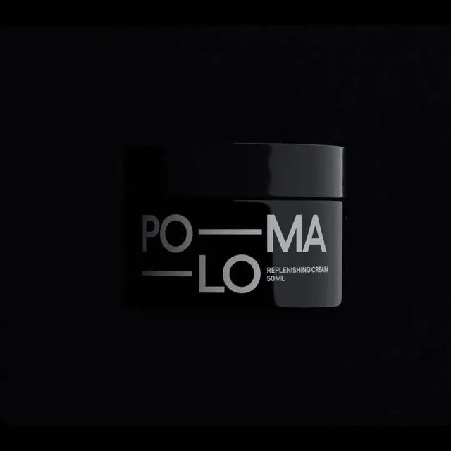
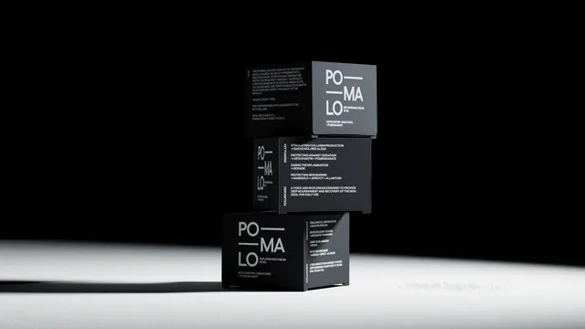
Three matte black Pomalo skincare cartons stacked off-axis in a hard spotlight, showing the stacked PO MA LO lockup and side-panel copy.
More like this
See all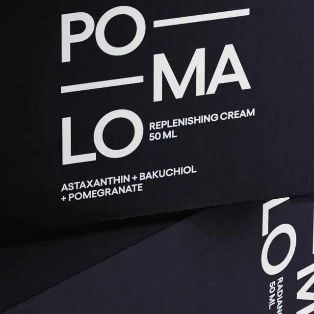

Summary
A packaging hero: three matte black cartons stacked and rotated off each other in a single hard spotlight, so the same typographic front panel reads three times at three angles.
Visual description
The scene sits on a pale sweep against near-black, lit by one narrow beam that pools on the surface and leaves the upper background solid black. The three cartons are cube-like and matte, each turned a different way so both the front and one side panel are visible on every box. The front panel carries the brand name broken across three lines in light grey caps, with long thin horizontal rules running out from the first and third lines to fill the measure, giving the lockup a grid-like structure. Under it sit the product descriptor and volume in smaller caps, and at the base a plus-separated ingredient line. Side panels carry dense small-caps copy: one a paragraph of care and storage information with a rotated vertical label at its edge, another a list of benefit statements each followed by an arrow and its ingredients, plus a short description paragraph and a second rotated vertical label. Everything is light grey on black, with no color, imagery, icon or foil anywhere.
Key takeaway
The rules that extend from the shortened name lines turn a three-line stack into a justified typographic block, which is what makes the front panel feel designed rather than merely centered. Rotated vertical section labels down the side panels give dense regulatory and ingredient copy a hierarchy without adding a second color. Lighting a monochrome matte pack with one hard beam is what supplies the drama the palette refuses to.
Reuse notes
A reference for premium unisex skincare or any pack that wants to look clinical and expensive at once, and a good argument for treating mandatory copy as a design element. The all-black scheme needs strong lighting and a matte stock to avoid looking flat, and the light grey on black will lose contrast on small ecommerce thumbnails. Pairs with the macro crop of the same pack.