Preview image. Unlock full-res
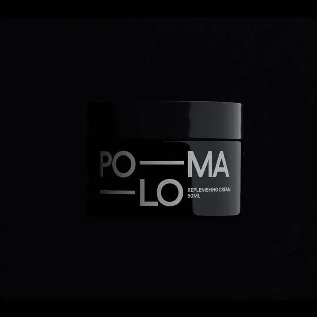
Square low-key product render of a black cream jar whose PO-MA-LO wordmark is only just readable against a black background.
More like this
See all
Summary
A squat black cream jar centered in a square black frame, lit so faintly that the pack reads mostly as a silhouette with a grey wordmark floating on it.
Visual description
Square format, pure black ground. A wide cylindrical jar with a slightly overhanging screw lid sits dead center, occupying about half the frame width. A thin cool highlight traces the top rim of the lid and the left edge of the body, which is all that separates the pack from the background. The label is printed in mid-grey: the wordmark is set as two stacked all-caps lines, PO and MA on top, LO below, with horizontal rules filling the gaps so the letter pairs and the rules form a single rectangular block. To the right of the lower line, in much smaller all-caps, sit the words REPLENISHING CREAM and 50ML. Nothing else appears in the frame, no shadow on a surface, no reflection, no secondary props.
Key takeaway
The wordmark's construction is the idea: splitting a six-letter name into stacked two-letter pairs and filling the leftover space with rules turns a name into a compact typographic block that works at any size. Printing it tonal grey on black instead of white keeps a mass-market skincare pack looking restrained.
Reuse notes
Reach for this when a beauty or wellness brand wants quiet luxury over shelf shout. The square crop makes it drop straight into a social grid or a product tile. Low contrast is the risk: at thumbnail size the pack nearly disappears, so pair it with a brighter neighboring frame or lift the exposure for ecommerce.
More like this


Keep what you find
A free account saves references to boards and can send you a weekly email of picks based on what you save.
To see every result, go Pro.