Preview image. Unlock full-res
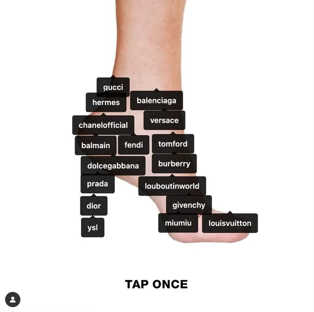
Mobile app interface with stacked black label cards listing luxury fashion brands, shown on a hand against white background.
Summary
Mobile app interface with stacked black label cards listing luxury brands, held in a hand with "tap once" instruction below.
Visual description
A light white background holds a photograph of a hand (skin tone visible) gripping a mobile phone. On the screen, luxury fashion brand names (Gucci, Hermes, Balenciaga, Chanel Official, Versace, Balmain, Fendi, Tomford, Dolce & Gabbana, Burberry, Prada, Louboutin World, Dior, Givenchy, Miumiu, Louis Vuitton, and others) are displayed in white sans-serif type on black rounded-rectangle cards. The cards are stacked and slightly offset in a vertical cascade, creating rhythm and suggesting they can be tapped or swiped. Below the phone, bold black uppercase text reads "TAP ONCE." The monochrome color scheme (black labels on white phone) with the warm flesh tone creates a simple, premium, and interactive gesture.
Key takeaway
Stacking label cards in a cascading offset pattern conveys both order and interactive possibility without animation. Naming a direct interaction ("TAP ONCE") with large, confident typography grounds the gesture and removes ambiguity. Showing the brand selector in-hand instead of just a clean mockup adds tactile, lifestyle credibility to the interface.
Reuse notes
Excellent for luxury e-commerce, fashion discovery, or brand-curation apps. The monochrome black-on-white approach reads premium and high-contrast in advertising or product photography. Works as a hero image for fashion/beauty apps or brand-aggregator platforms. Avoid if the brand list is massive (becomes unreadable); best for curated collections of 10-20 high-tier brands.