Preview image. Unlock full-res
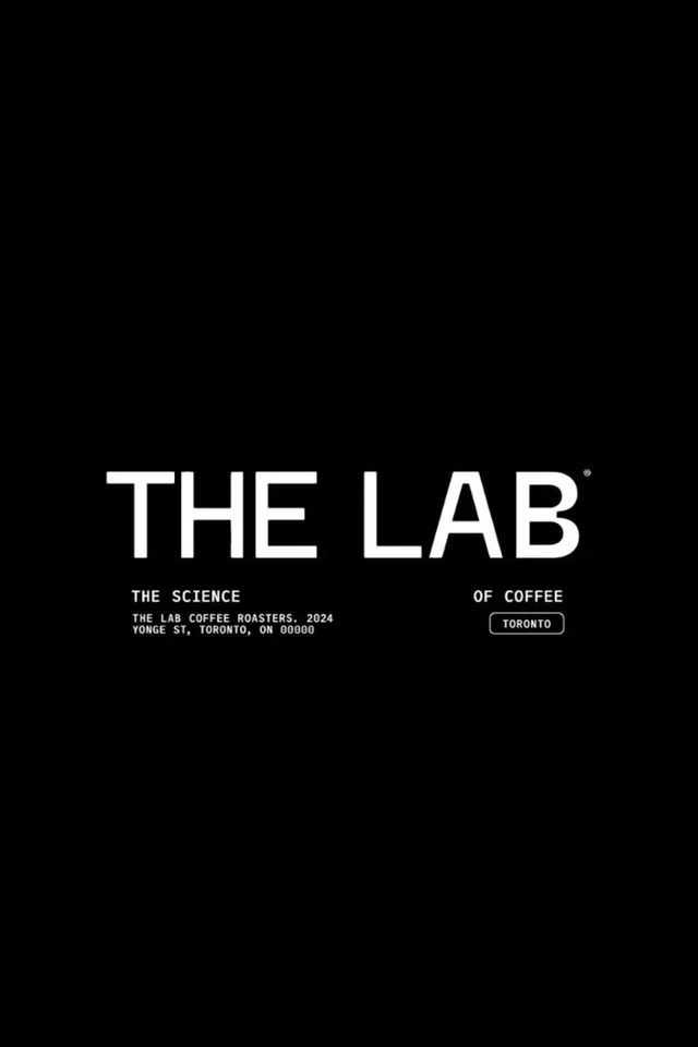
A centered white THE LAB wordmark with registered mark, captioned The Science of Coffee, set on full black with monospaced address details.
Summary
A coffee-brand logo lockup: a large white THE LAB wordmark with a small registered symbol, sitting on solid black above monospaced supporting copy that splits the tagline The Science of Coffee across the line.
Visual description
The frame is pure black with everything anchored slightly below center. THE LAB is set in a wide, even-weight geometric sans in white caps, with a tiny circled R mark hung at the top-right of the B. Below it, two monospaced labels flank the wordmark: THE SCIENCE on the left, OF COFFEE on the right, so the tagline reads across the gap. A small block of monospaced address copy (THE LAB COFFEE ROASTERS. 2024 / YONGE ST, TORONTO, ON 00000) sits under the left label, and an outlined rounded pill containing TORONTO sits under the right. Generous black space surrounds the entire mark.
Key takeaway
Splitting the tagline left and right of the logo so the wordmark sits inside its own sentence. Pairing a clean geometric display sans with a typewriter-like monospace for the metadata gives a lab or technical feel without any icon.
Reuse notes
A go-to for specialty coffee, spirits, or any premium maker brand that wants a clinical, understated identity. The monospace-as-data-label move suits packaging back panels and footers; it only holds up on a dark, uncluttered field.
More like this






Keep what you find
A free account saves references to boards and can send you a weekly email of picks based on what you save.
To see every result, go Pro.