Preview image. Unlock full-res
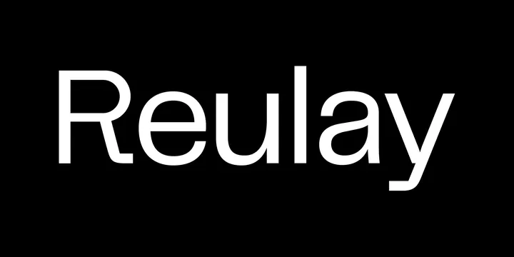
The wordmark 'Reulay' set in lowercase-height white grotesque sans on a pure black field, with a distinctive straight-cut diagonal tail on the y as its one signature flourish.
Summary
A single-word logotype, "Reulay", in white grotesque sans centered on solid black, defined by the sharp straight-cut terminal on the descending y.
Visual description
The wordmark sits dead center on a 2:1 black banner, white type, no tagline, icon, or other element. The face is a clean modern grotesque with even stroke weight, a double-storey lowercase a, a capital R with a straight leg, and large open counters. The one piece of personality is the y: instead of a curved tail it ends in a long straight diagonal cut to a flat tip, giving the otherwise neutral word a precise, engineered finish. Generous tracking and large size make it read as a finished logo lockup rather than a type test.
Key takeaway
Take an off-the-shelf neutral grotesque and customize exactly one terminal (here the y tail) so the wordmark gains a memorable signature without losing the safe, legible base. White-on-black at large size with wide tracking is a reliable formula for a premium tech wordmark.
Reuse notes
Template for a software, AI, or studio brand that wants to read clean and confident. Works as a splash, footer, or loading lockup. The minimalism means the brand voice has to come from elsewhere; on its own it is intentionally quiet.
More like this





Keep what you find
A free account saves references to boards and can send you a weekly email of picks based on what you save.
To see every result, go Pro.