Preview image. Unlock full-res
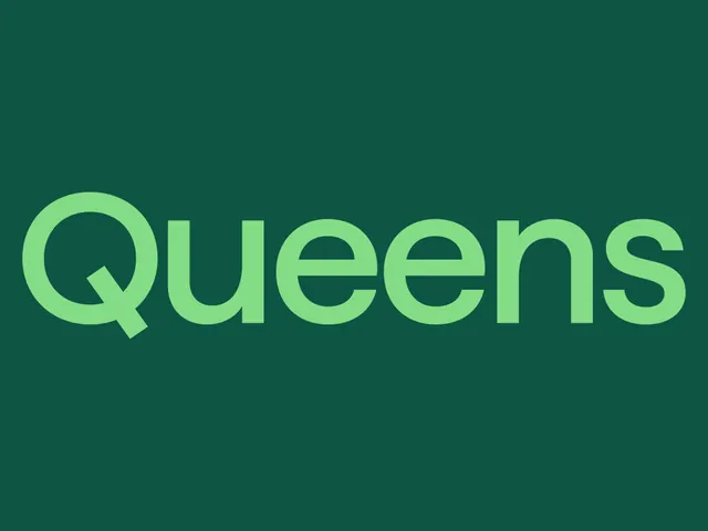
The Queens wordmark set large in light green on a deep forest-green field, with a diagonal cut through the Q tail.
More like this
See all
Summary
The bare Queens wordmark presented tonally, light green on dark green, with nothing else in frame.
Visual description
A flat deep forest-green field fills the frame. The word "Queens" runs almost edge to edge in a light spring green, set in a soft geometric grotesk with generous round bowls, a single-storey lowercase a-free construction, and noticeably tight but even spacing. The Q is capitalized and its tail reads as a short straight bar cut at an angle where it crosses the bowl, sitting slightly below the baseline. The two e's are wide with horizontal bars, and the terminals on the s are cut on a shallow diagonal. Nothing else appears in the frame, no tagline, no rule, no mark.
Key takeaway
The angled cut on the Q tail is the only piece of drawing in an otherwise neutral grotesk, and it is enough to make the mark proprietary. Presenting it tonally rather than at full contrast signals confidence and keeps the mark feeling soft rather than shouted.
Reuse notes
A clean model for a retail wordmark that has to sit on packaging, apparel and screen at every size. The tonal green pairing has a lower contrast ratio than it looks, so a light-on-dark treatment like this is a display move, not a small-size or body-copy one. Pairs well with a light neutral ground for the inverse lockup.
More like this




Keep what you find
A free account saves references to boards and can send you a weekly email of picks based on what you save.
To see every result, go Pro.