Preview image. Unlock full-res
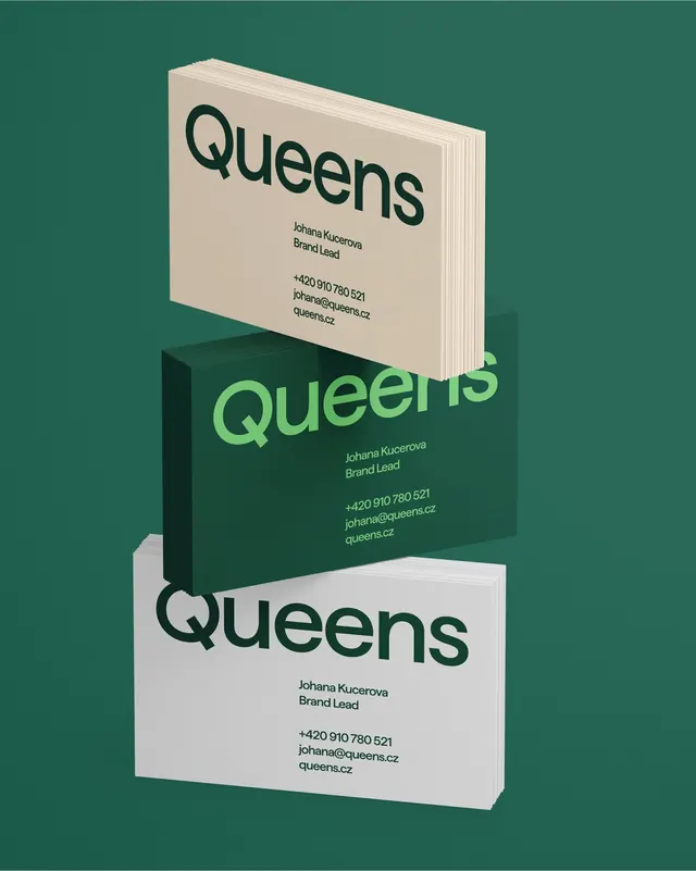
Three stacks of Queens business cards floating at an angle on green, in sand, forest green and white colorways.
More like this
See all


Summary
Three stacks of Queens business cards shown in three colorways, tilted and floating in a stepped diagonal against a green backdrop.
Visual description
A mid-green field holds three thick card stacks angled slightly out of plane and overlapping down the frame: sand at top, dark forest green in the middle, light grey-white at the bottom. Each card runs the Queens wordmark oversized across the upper half, bleeding close to both edges, then a small two-line name block reading "Johana Kucerova / Brand Lead" and, after a gap, a three-line contact block with a phone number, an email and queens.cz. The type sits centered-left in the lower half rather than aligned to the wordmark's left edge. Colorways invert the ink: dark green on sand, spring green on forest green, near-black on white. Cut edges of the stacks are visible on every card, and soft shadows fall between them.
Key takeaway
Letting the wordmark break the card's own margin, running almost edge to edge, turns a name card into a brand card. Three colorways of one layout give the brand a stationery family without a single new design.
Reuse notes
A clean approach for stationery when the wordmark is the whole identity and there is no symbol to place. The contact block sitting inset rather than left-aligned to the mark is a deliberate looseness that will read as a mistake in a stricter, more corporate system. The floating-stack presentation flatters thick uncoated stock specifically.