Preview image. Unlock full-res
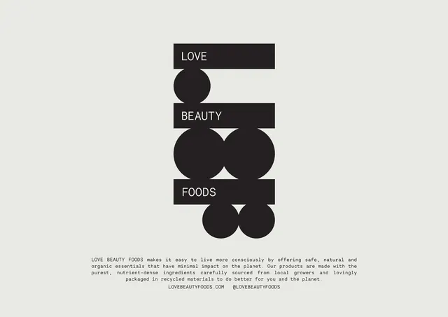
The LBF monogram presented large on off-white, built from three black bars and interlocking circles with LOVE, BEAUTY and FOODS reversed out of the bars.
More like this
See all

Summary
A single large presentation of the LBF monogram, assembled from three horizontal black bars and a set of black circles that lock together into stacked letterforms on a bare off-white field.
Visual description
The frame is a flat off-white sheet with the mark centered in the upper two thirds. Three solid black horizontal bars stack vertically, each carrying one word of the name in small white all-caps sans set flush left inside the bar: LOVE, then BEAUTY, then FOODS. Between and below the bars sit solid black circles at three different diameters, a single small circle under the first bar, a pair of large overlapping circles under the second, and two more circles hanging below the third bar so the mark ends on a curve rather than a straight edge. Read together the bars and circles form oversized L, B and F shapes on their side. Nothing is outlined and no shape is tinted, so the whole mark is one weight of black. Beneath it, a four-line block of monospace body copy is justified to a narrow measure and centered, describing the brand in sentence case, followed by a line with the website address and the social handle in all-caps monospace. Margins are wide and the lower half of the sheet is mostly empty.
Key takeaway
The monogram is drawn from only two primitives, a bar and a circle, which lets the name sit inside the mark instead of beside it. Hanging the final circles past the bottom bar keeps a rigidly geometric construction from feeling boxed in.
Reuse notes
Good reference for a monogram that has to carry a three-word name without an accompanying wordmark, and for logo presentation pages where the mark plus a short monospace boilerplate is the whole layout. The mark depends on high contrast and a lot of surrounding space, so it will lose its letterform reading at small sizes or on a busy background.