Preview image. Unlock full-res
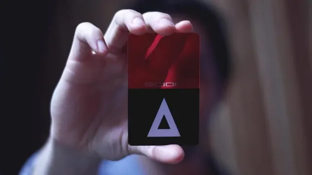
A small square logo held in hands showing a dark-red or maroon field in the top half with the word 'solo' and a light-blue triangle in the bottom half against black.
Summary
A compact square logo held in hand showing a two-color design: dark-maroon field with small white text ("solo") in the top section, and a simple light-blue triangle pointing upward against black in the bottom section.
Visual description
A small square divided horizontally. Upper half: dark wine-red or maroon background with minimal white sans-serif text. Lower half: pure black background with a single light periwinkle or sky-blue triangle. The geometry is pure and restrained. The photo context shows the logo as a physical object or product surface (held in fingers).
Key takeaway
A two-tone icon can convey identity with minimal elements. The triangle as a single mark is memorable and simple. The color opposition (warm/cool, dark/light) creates balance without clutter.
Reuse notes
Strong reference for tech or app logos needing a geometric, approachable identity. The simplicity translates well across scales—works as favicon, app icon, or print mark. The maroon-to-blue color story is contemporary and calm.