Preview image. Unlock full-res
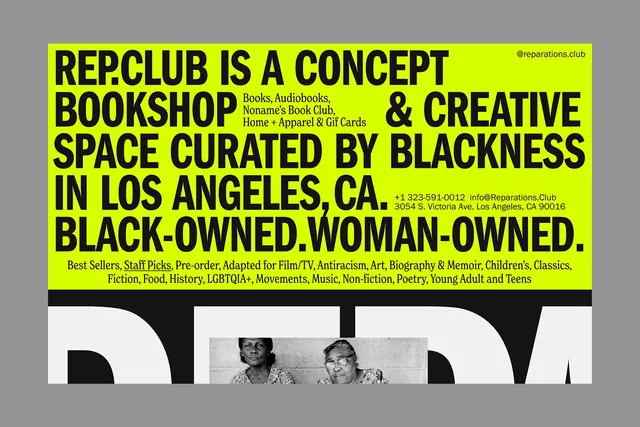
A page layout whose fluorescent hero is one continuous sentence in heavy caps, with small serif copy slotted into the gaps between the lines.
More like this
See all
Summary
A wide fluorescent panel filled edge to edge with a single mission statement set in heavy caps, with smaller serif blocks tucked into the slack left by the ragged line breaks.
Visual description
The upper block is fluorescent yellow green and runs nearly the full width of the frame. Five lines of black condensed grotesque caps read REP.CLUB IS A CONCEPT BOOKSHOP & CREATIVE SPACE CURATED BY BLACKNESS IN LOS ANGELES, CA. BLACK-OWNED.WOMAN-OWNED., set so tight that descenders nearly touch the next cap-height and the last line stretches to both margins. Where a line falls short, a small serif paragraph fills the hole: after BOOKSHOP, a four line list reading Books, Audiobooks, Noname's Book Club, Home + Apparel & Gif Cards; after CA., two lines of phone, email and street address. A small serif @reparations.club sits at the top right corner. Below the caps, two lines of serif set a long category list from Best Sellers through Young Adult and Teens, with Staff Picks underlined. A black band closes the panel, and beneath it the layout continues in off white with a giant white letterform partially visible and the same archival photograph of two seated women, both cropped by the bottom edge of the frame.
Key takeaway
Treating the ragged right edge as usable space, and filling it with a contrasting serif at one sixth the size, turns a statement into a dense information object. The extreme size jump between the two typefaces is what keeps the small copy readable instead of decorative.
Reuse notes
Best for a brand whose positioning sentence is genuinely worth setting at that size, since the layout has nowhere to hide a weak line. Requires manual line breaking and will not survive a responsive reflow without art direction at every breakpoint. Pairs well with the plain black and white sections that follow it.
More like this




Keep what you find
A free account saves references to boards and can send you a weekly email of picks based on what you save.
To see every result, go Pro.