Preview image. Unlock full-res
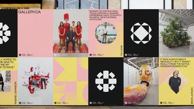
Large outdoor hoarding tiled with square poster panels in black, pink and yellow, alternating geometric medallion marks with artist quotes and portraits.
More like this
See all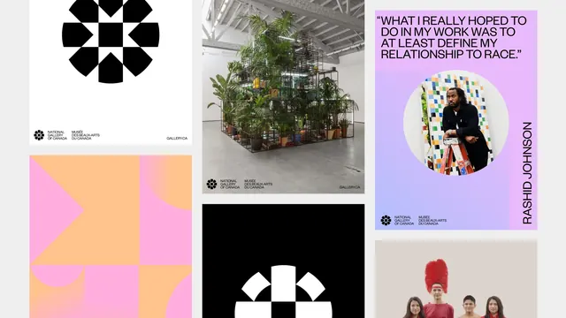
Summary
A long exterior hoarding built from square poster panels of equal weight, where solid colour, the geometric mark, artwork photography and artist quotes are treated as interchangeable tiles.
Visual description
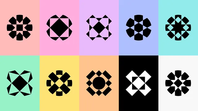
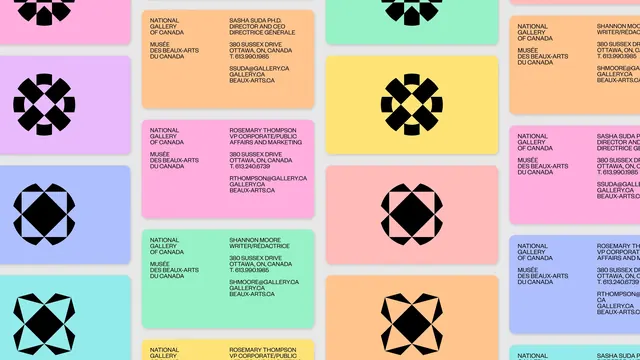
Two rows of square panels run the width of the frame, mounted on a hoarding in front of a glass and stone building. The panels cycle through a small set of types. Black panels carry a single large white geometric medallion built from squares, quarter circles and diamonds, in several different configurations. Pink and yellow panels carry a short pull quote in tight all-caps sans, set flush left across three or four lines, such as "SO MANY OF OUR CULTURAL TOOLS, ESPECIALLY AGAINST OPPRESSION, HAVE TO DO WITH PHYSICAL OR SITUATIONAL UPCYCLING." Some quote panels sit on a soft pink to yellow gradient and hold a circular cropped portrait of the artist, with the artist's name set vertically along the right edge in all caps. Other panels are full-bleed photography: a group portrait in red on a patterned rug, a sculptural mass of red and white sneakers, a metal scaffold packed with plants in a gallery, a large soft yellow and pink installation. One pink panel is empty except for "GALLERY.CA" at the top left, and another is a flat field of yellow with large pink geometric shapes. Every panel carries the same small bilingual lockup at the bottom left, the medallion mark beside "NATIONAL GALLERY OF CANADA" and "MUSÉE DES BEAUX-ARTS DU CANADA" in two tight columns.
Key takeaway
The identity works as a kit of square tiles rather than a fixed layout, so quotes, portraits, artwork and pure graphic panels can be shuffled to fit any length of wall. Repeating one small bilingual lockup in the same corner on every panel is what holds the mix together.
Reuse notes
Strong reference for museums, festivals and any institution with a wide range of imagery and a bilingual requirement. The system depends on high-quality artwork photography to stop the flat colour panels from feeling empty. Vertical names along the edge free up the panel face but only work at hoarding scale.
More like this


Keep what you find
A free account saves references to boards and can send you a weekly email of picks based on what you save.
To see every result, go Pro.