Preview image. Unlock full-res
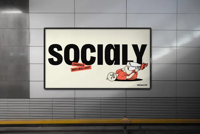
Horizontal backlit billboard where a cream field is filled edge to edge by the black wordmark, punctuated by two red sticker labels and one sprawling line-art character.
More like this
See all

Summary
A landscape lightbox in a tiled transit corridor given over almost entirely to the wordmark, with the tagline demoted to two small angled red stickers.
Visual description
The unit is a black-framed backlit poster case mounted on a grey tiled wall above a slatted metal grille and a yellow platform edge line. Inside, a warm cream field carries "SOCIALY" in extremely heavy black grotesque, set so large it nearly touches both side edges; the "a" is the same rotated single-storey form used across the identity. Two small red rectangles sit at a slight tilt over the lower-left of the wordmark, reading "L'AGENCE" and "ANTI-BULLSHIT" in black caps, as if stuck on by hand. At the right, a black-outline character in a red top and white trousers lies on its back with legs kicked up, drawn flat on a solid black elliptical shadow, and overlapping the final letters. The URL "SOCIALY.FR" sits small and black in the bottom-right corner.
Key takeaway
Letting the wordmark be the entire artwork and reducing the positioning line to a stuck-on label reads as confidence rather than a missing layout. The character overlapping the letterforms keeps a purely typographic panel from feeling static.
Reuse notes
Strong model for a brand-awareness burst where recognition of the name matters more than explaining the offer. Works because the wordmark is distinctive enough to carry a whole frame; a generic logotype would look empty here. The angled sticker device is easy to overuse, so keep it to one or two per surface.