Preview image. Unlock full-res
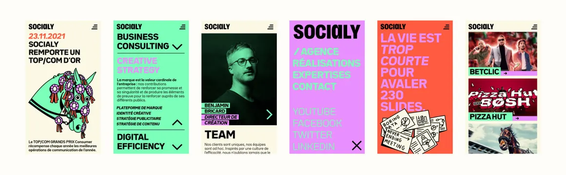
Six mobile web screens shown side by side on cream, each a full-bleed color block carrying the wordmark, heavy French all-caps type and flat line-art or cut-out imagery.
More like this
See all
Summary
A flat lineup of six mobile screens on a cream ground, showing how one loud poster language survives inside a small responsive layout.
Visual description
Six portrait phone-width screens sit in an evenly spaced row with no device frames. Each opens with the same header bar: the black "SOCIALY" wordmark top-left and a three-bar menu icon top-right. Screen one is cream, with a red date line, a black all-caps award headline, a mint and lilac line drawing of a rosette-covered horse head, and a paragraph of small body copy. Screen two is mint, with an accordion list where "BUSINESS CONSULTING" and "DIGITAL EFFICIENCY" are collapsed under chevrons and "CREATIVE STRATEGY" is expanded in lilac with a short paragraph and four italic sub-items. Screen three is cream with a duotone green portrait, a lilac name tag reading a creative director credit, a circular arrow control, and the heading "TEAM". Screen four is a full lilac navigation overlay listing four black and mint menu items over a very large wordmark, with social links below and a black close cross. Screen five is red-orange, all type: a lilac and white all-caps line about slides, over a cluster of small hand-drawn note cards. Screen six is cream, a stacked list of client cases with full-bleed campaign images and lilac and mint label bars with arrow links.
Key takeaway
The system holds together because only the background color changes: header, type weight, and label bars stay identical across screens, so each page reads as a different poster in the same run rather than a different template.
Reuse notes
Good reference for taking a print-led identity into a small-screen site without diluting it, especially the trick of using a saturated full-screen color as the page-level identifier. Note the heavy all-caps headlines only work at these short French copy lengths; longer strings would break the rhythm. The lineup format itself is a clean way to present responsive work in a case study.