Preview image. Unlock full-res
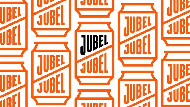
A tiling brand pattern of line-drawn beer cans in orange on white, each holding the JUBEL wordmark twice, with one can picked out in black.
More like this
See all
Summary
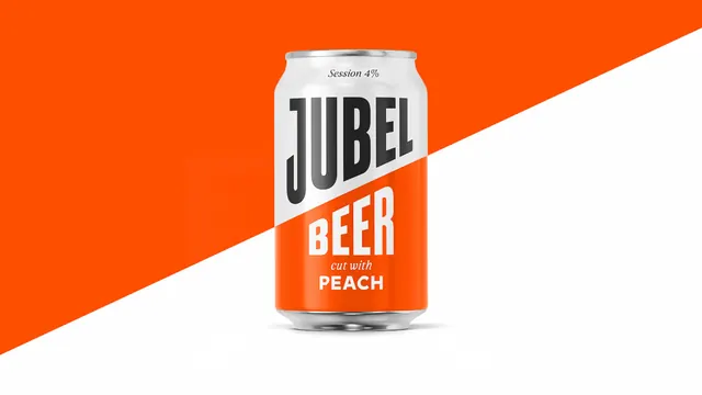
A supporting pattern that reduces the pack to an outlined can silhouette and repeats it, with one black wordmark placed as the single point of emphasis.
Visual description
A white field carries a grid of tall can outlines drawn in flat orange strokes, with the shouldered top and the rolled base rendered as simple stepped lines. Each can is crossed by the brand diagonal, and the JUBEL wordmark appears twice inside it, once above the diagonal and once below, set in the heavy condensed all-caps face. Columns are offset vertically so the rhythm staggers rather than lining up in rows, and cans are cropped at every edge to imply an endless repeat. In the centre column, one wordmark is set in black instead of orange, creating a single focal point in an otherwise uniform field. There is no fill inside any can, so the pattern stays light and the white ground dominates.
Key takeaway
Turning the primary product silhouette into a line-drawn repeat gives a brand a secondary surface graphic for free. Flipping exactly one element to black is a cheap and effective way to stop a uniform pattern from feeling like wallpaper.
Reuse notes
Ready for carrier bags, coasters, van livery, merchandise, web section backgrounds and any place the identity needs to fill space without a headline. Because it is line-only it stays quiet behind type, but the doubled wordmark means it should not be scaled down far or the pattern turns into noise.