Preview image. Unlock full-res
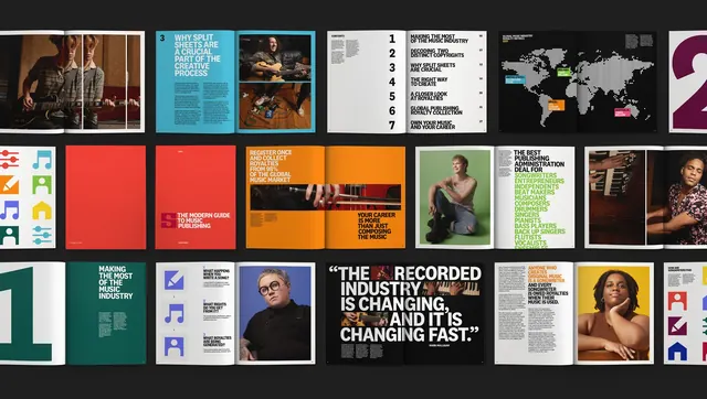
A twelve-up grid of spreads and covers from a music publishing guide on black, showing color-coded chapters, oversized numerals, portrait photography and a flat icon set.
More like this
See all

Summary
An overview grid of a printed music publishing guide, laid out in three rows on black so the chapter color system and the repeating spread structures can be compared at once.
Visual description
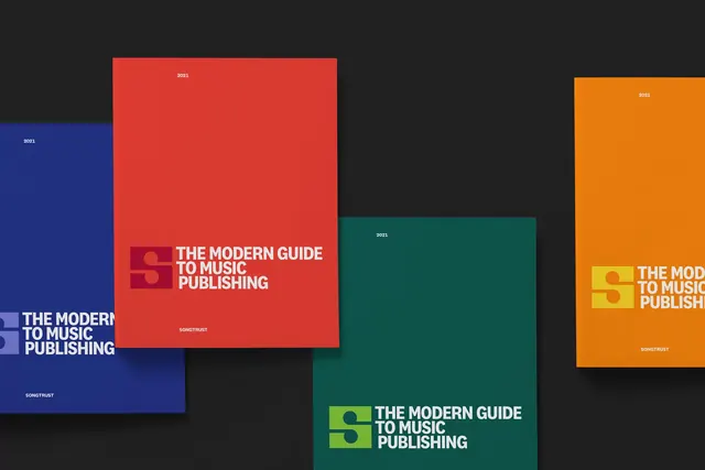
Roughly twelve open spreads and closed covers float on a near-black field in three loose rows, each with a soft page curl and drop shadow. The system runs on full-bleed chapter colors: cyan, red, orange, deep green, yellow and magenta. Recurring devices include an oversized numeral bleeding off the page edge to mark a chapter, a contents page that stacks the figures one to seven in a huge column beside short all-caps entry titles with folios, and a dark royalty metrics spread carrying a world map built from a dotted halftone grid with small colored callout labels pinned to territories. Photography is studio portraiture of musicians on colored seamless plus documentary shots of guitars, pedalboards and keyboards; several spreads run a photo as a narrow horizontal band across both pages. One spread is a black pull-quote page with a large white condensed caps quote overprinting a faded photo. Another lists creator roles in a long green all-caps column. A red cover shows the guide title beside the S monogram in a darker red block, and repeated pages use a flat square icon set in primary colors.
Key takeaway
Chapter color plus one oversized numeral does all the navigation work, so the interior can stay a plain white grid and still feel designed. Cropping the numeral off the page edge is what keeps a text-heavy guide from reading as a report.
Reuse notes
A strong model for long-form brand content, annual guides or education publications where a reader has to find a section quickly. The dotted-map treatment is a reusable way to show global data without a literal atlas. Note the system needs a large photo library and enough pages for the color coding to pay off; under about six sections it would look arbitrary.
More like this


Keep what you find
A free account saves references to boards and can send you a weekly email of picks based on what you save.
To see every result, go Pro.