Preview image. Unlock full-res
A street hoarding in off-white with rounded-corner photo tiles scattered around the edges and an oversized More to explore headline in the centre.
More like this
See all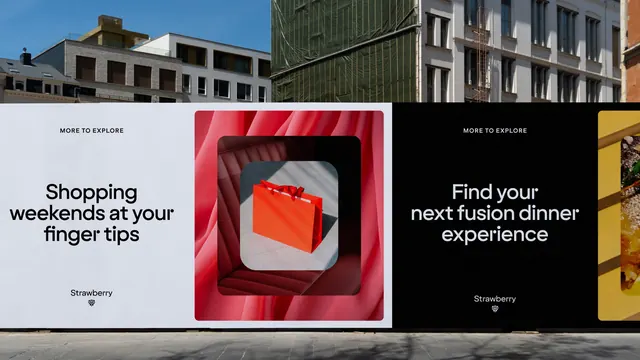
Summary
A large-format hoarding that pushes all its imagery to the perimeter as rounded-corner tiles and leaves the middle almost entirely empty for one line of oversized type.
Visual description
The panel is a warm off-white and spans the full width of the frame, fixed across the ground floor of an older stone building whose upper windows and a yellow stained-glass canopy are visible above. Photographic tiles with softly rounded corners are placed around the edges at different sizes and are cropped by the panel boundary: a person lying on striped bedding at the far left, a harbour skyline with a hot air balloon at the upper left, a bartender garnishing a cocktail at the upper right, a restaurant interior with teal banquettes bleeding off the right edge, two hikers on a hillside at the lower left, and sunglasses casting a shadow on sand at the lower right. In the centre, small tracked-out all-caps type reads "A NEW EXPERIENCE" above a very large single-line headline, "More to explore", set in a geometric sans with a distinctive round-shouldered lowercase r. Below the headline sits the "Strawberry" wordmark with a small mark beneath it made of clustered dots arranged into a berry silhouette. Type is near black throughout; the only saturated color comes from inside the photographs.
Key takeaway
Treating photography as tiles pushed to the margins turns a wide format into a frame rather than a collage, and the emptiness in the middle is what makes the headline feel large. Rounded corners at a consistent radius are enough to unify images with nothing else in common. The dot-cluster mark restates the brand name pictorially so the wordmark never needs explaining.
Reuse notes
Well suited to launch, teaser, or campaign out-of-home for a brand with a broad and visually inconsistent image library, since the tiles absorb variety. The approach needs real width; compressed to a portrait format the perimeter tiles would crowd the headline. Photography must be strong enough to survive being cropped arbitrarily by the panel edge.