Preview image. Unlock full-res
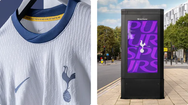
A two-up pairing of a close crop on the white home shirt with a tonal crest, next to a digital street kiosk showing oversized overlapping Spurs lettering in purple.
More like this
See all
Summary
Two applications shown side by side, one almost silent and one very loud: a tonal crest embossed into the shirt fabric, and a street panel where the club name is blown up until only fragments of the letters remain.
Visual description
The frame is split into two panels with a white gutter. The left panel is a tight crop of a white football shirt on a hanger, lit softly from the left. The knit shows a fine raised cable texture across the chest and shoulder. A navy ribbed collar sits at the top, with a gold-yellow neck tape inside carrying the club name in small navy caps. A grey supplier swoosh sits below the collar and a larger one at the lower left. On the chest, the cockerel crest is applied in a pale slate blue that is barely darker than the shirt, so it reads as tone rather than as a badge. The right panel is a daylight street photograph of a black digital advertising kiosk on a pavement, with trees, traffic lights and a white office block behind. Its portrait screen shows a violet field with the club short name set in enormous soft-focus purple letters that overlap and run off all four edges, leaving only partial letterforms visible. A small solid white cockerel is centred on the screen with the founding year to its left and a three-letter city abbreviation to its right.
Key takeaway
Putting a whisper-quiet product detail next to a maximum-volume street panel in one frame is a fast way to prove an identity's dynamic range. Cropping the wordmark until it is unreadable works precisely because the small white crest in the middle supplies the identification.
Reuse notes
A good template for a case study page that has to show retail and out-of-home in a single image. Tonal-on-tonal crests need controlled lighting to photograph at all, so plan the shot rather than relying on flat product imagery. Cropped oversized type only survives for brands whose name is already known; for a new brand keep at least one complete reading of the wordmark in the layout.