Preview image. Unlock full-res
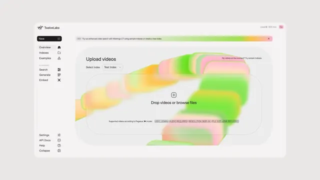
Light-mode product console for a video AI platform, with a soft gradient ribbon flowing behind an empty upload dropzone.
More like this
See all
Summary
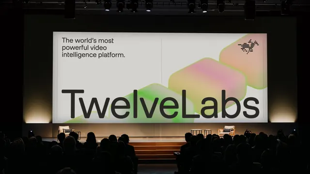
A product screen where the brand's gradient motif is enlarged and blurred into a ribbon that flows across the empty upload area, turning an empty state into the most branded moment in the app.
Visual description
A rounded app window floats on a pale grey page. The left sidebar carries the horse mark and "TwelveLabs" at top, a black pill button labelled "New" with a plus icon, then a nav list of Overview, Indexes and Examples with small outline icons, a "PLAYGROUND" group heading above Search, Generate and Embed, and a bottom cluster of Settings, API Docs, Help and Collapse. The top right shows "Used 0 / 600 min" and a pink circular avatar reading CJ. Below the header a dismissible banner with a "NEW" pill announces an enhanced video search release, its right half washing into a green to orange to pink gradient. The main panel is titled "Upload videos" with a "Select index" label and a "Test Index" dropdown, then a large dashed-outline dropzone containing a circled plus and "Drop videos or browse files". Small outlined chips beneath list supported specs. A heavily blurred ribbon of stacked green, pink and orange rounded slabs runs diagonally behind everything.
Key takeaway
Scaling the identity's gradient shapes far past their normal size and blurring them turns them into ambient product art that never competes with the UI. Putting that art in the empty state means the brand is loudest exactly when the product has nothing to show.
Reuse notes
Useful for AI or media tools that need warmth in an otherwise neutral console. The gradient sits under interactive elements, so it only works because everything above it is high-contrast black on near-white; a mid-tone UI would lose legibility fast.