Preview image. Unlock full-res
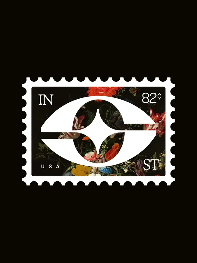
A brand identity concept for Insight Studio built around an eye and star logomark, applied across business cards, embossed kraft surfaces, a postage stamp, and photographic texture treatments.
More like this
See all
Summary
A brand identity concept for Insight Studio built around an eye and star logomark, applied across business cards, embossed kraft surfaces, a postage stamp, and photographic texture treatments.
Visual description
A single perforated postage stamp sits centered on a flat black field, its scalloped white edge reading as the only frame in the composition. Inside, a solid white eye-shaped mark with a four-pointed star pupil is knocked out of a dark Dutch-style floral still life, so red tulips, orange and yellow blooms, and green stems show through the negative space of the iris. Serif capitals mark the corners: IN at top left and ST at bottom right, with 82 cents at top right and a letterspaced USA at bottom left. The palette is near-black with saturated red, orange, yellow, and green from the painting, against crisp white type and linework.
Key takeaway
Cut a bold geometric logomark out of a dense photographic or painterly image so the artwork itself becomes the fill, then set it inside a stamp die-cut frame to give a flat mark instant physical object presence.
Reuse notes
Reach for this as a identity system reference. Pairs with editorial, textured directions. Original by Daniel Ross Luft.
More like this



Keep what you find
A free account saves references to boards and can send you a weekly email of picks based on what you save.
To see every result, go Pro.