Preview image. Unlock full-res
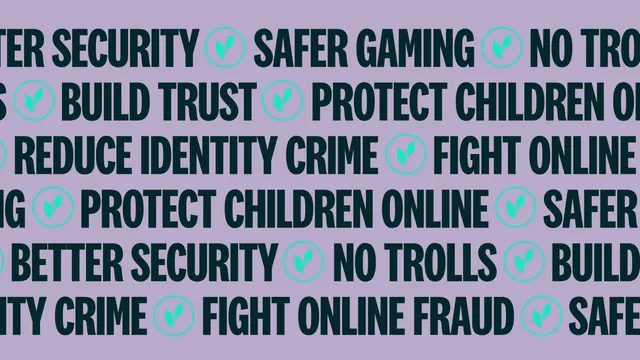
Repeating typographic pattern of short brand promises separated by circled chevron marks on a lilac field.
More like this
See all
Summary
A full-bleed type pattern built from six lines of short brand claims running edge to edge, punctuated by circled chevron marks.
Visual description
The whole frame is flat lilac. Six horizontal lines of heavy condensed all-caps in deep bottle green run across it, each line offset from the ones above and below so no phrase starts in the same place twice. Legible phrases include "BETTER SECURITY", "SAFER GAMING", "NO TROLLS", "BUILD TRUST", "PROTECT CHILDREN ONLINE", "REDUCE IDENTITY CRIME" and "FIGHT ONLINE FRAUD". Between every phrase sits the mint chevron mark inside a thin mint circle, acting as the separator in place of a bullet. Words are cut mid-letter at both left and right edges so the lines read as an endless ticker. There is no logo lockup, no hierarchy and no margin.
Key takeaway
Turning the messaging list itself into the pattern means the brand's surface graphics and its copy strategy are the same asset. Using the circled mark as the separator makes the logo appear dozens of times without ever being placed.
Reuse notes
A strong background system for packaging wraps, tote prints, event walls and scrolling banners where a brand has a list of short claims rather than one line. Needs enough phrases to avoid visible repetition, and the offsets have to be irregular or the pattern will band. Not usable behind other text.