Preview image. Unlock full-res
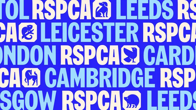
Full-bleed blue field of repeating oversized RSPCA wordmarks, UK city names and octagonal animal icons set as a two-tone pattern.
More like this
See all
Summary
A repeating band pattern built from the wordmark, a UK place name and an octagonal animal icon, cropped so the sequence runs off both edges.
Visual description
Five horizontal lines of oversized all-caps type fill a royal blue field, each line alternating "RSPCA" in warm cream with a city name in pale sky blue: Bristol, Leeds, Leicester, London, Cardiff, Cambridge and Glasgow are all partly visible, every line clipped at both ends. Between the words sit octagonal tiles in cream, each holding a solid blue animal silhouette drawn in the same geometric style: a seated dog, a chameleon on a branch, a duck, a horse and a hedgehog. Letterforms are a tight humanist grotesque with almost no space between lines, so the type stacks into a solid mass. Only three colours appear, and the icons are the only non-typographic element.
Key takeaway
The branch name is treated as part of the logo lockup rather than a subtitle, which lets one national identity flex to dozens of local centres. Setting the animal marks inline as if they were characters makes the icon set behave like punctuation in a sentence.
Reuse notes
Useful for federated organisations with many local chapters, and for filling large surfaces such as vehicle livery, hoardings or shop fronts where a single logo would look lost. The tight leading and heavy crop mean it works as texture, not as a place to communicate detail.
More like this



Keep what you find
A free account saves references to boards and can send you a weekly email of picks based on what you save.
To see every result, go Pro.