Preview image. Unlock full-res
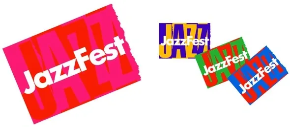
Multiple colorful variations of a "JazzFest" logotype with bold, angled rectangles in vibrant color combinations.
Summary
A grid of four different color variations for a "JazzFest" logotype, each using bold, angled rectangular forms arranged behind and around the text.
Visual description
Each variation rotates and arranges colored rectangular planes—bright magenta, red, yellow, blue, green—behind and overlapping the white sans-serif "JazzFest" wordmark. The type is set in all-caps, tightly spaced. The angled, geometric rectangles create a 3D sense of depth and movement, suggesting dynamism and energy.
Key takeaway
Using a single wordmark with multiple color-plane variations to explore brand personality quickly; the staggered rectangular forms anchor the identity without being tied to a symbol.
Reuse notes
Strong reference for event or music-focused branding systems; the geometric language works well for festivals and youth-facing brands needing bold, kinetic energy.