Preview image. Unlock full-res
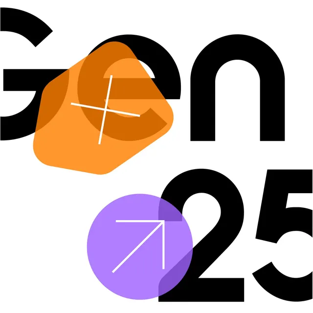
A GEN 25 event lockup in heavy black type overlaid with semi-transparent orange and purple shapes carrying white crosshair and arrow icons.
Summary
An event identity reading GEN 25, where massive black letters are partly hidden behind translucent orange and purple shapes that multiply over the type and carry small white crosshair and arrow glyphs.
Visual description
On a white field, the characters G, e, n, 2, 5 are set in a very heavy black sans, oversized to the point that the G and the e bleed off the edges and crop. Layered on top, a rounded orange square (rotated slightly) and a violet circle sit semi-transparent, deepening to a darker shade where they overlap the black letterforms, a multiply-blend effect. Each translucent shape holds a thin white line icon: an off-center plus or crosshair in the orange, and a diagonal up-right arrow in the purple. The result is dense and layered despite using only black, white, and two accent hues.
Key takeaway
Setting translucent accent shapes in multiply over oversized black type creates real depth and a third color for free where the layers cross. Cropping the letters hard at the canvas edge makes a static lockup feel like a frame from a larger motion system.
Reuse notes
A strong template for a conference, generative-AI, or product-launch identity that needs to flex across slides, social, and motion. The translucent-shape-plus-icon kit becomes a reusable system. Caveat: heavy cropping can hurt legibility of the name; make sure the full wordmark exists in a cleaner companion lockup.
More like this



Keep what you find
A free account saves references to boards and can send you a weekly email of picks based on what you save.
To see every result, go Pro.