Preview image. Unlock full-res
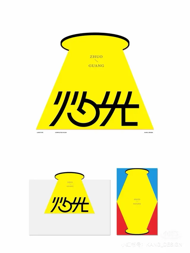
A Chinese logotype presentation where the characters sit inside a yellow ceiling-spotlight beam, shown as a main mark plus two color-block application mockups.
Summary
A logotype case study built around a beam of light: bright yellow Chinese characters reading as a spotlight cone spilling from a ceiling fixture, with the pinyin ZHUO GUANG and two application mockups below.
Visual description
The hero mark is a yellow trapezoid that widens downward from a black-outlined oval at top, reading as a recessed ceiling light casting a cone of glow. Inside the lower beam, custom black brush-like Chinese characters are drawn with curved tapering strokes that echo flickering flame and light. Small serif pinyin "ZHUO / GUANG" sits high in the beam, split by a thin diagonal connector. A tiny baseline of metadata reads LOGOTYPE, COMPLETED IN 2024, KANG_DESIGN. Below sit two smaller renderings: the beam on a neutral grey card, and a vertical poster where the beam stretches into a yellow lantern shape across blue, white, and red color blocks. A KANG_DES.GN credit appears bottom right.
Key takeaway
Turning the logotype container into a literal object: the wordmark lives inside a spotlight beam, so the mark and its meaning are one shape. The accompanying mockups show the same beam flexing from horizontal cone to tall lantern across primary-color backgrounds, a tidy way to prove a mark survives different formats.
Reuse notes
A model for presenting a single logotype as a mini case study, hero lockup plus a couple of application shots, rather than the mark alone. The spotlight-as-container idea suits lighting, theatre, media, or hospitality brands. Bold primary-color blocking carries energy but reads loud; dial back the palette for more corporate contexts.
More like this


Keep what you find
A free account saves references to boards and can send you a weekly email of picks based on what you save.
To see every result, go Pro.